
The Complete Branding Checklist for New Businesses
Branding is not just your logo. It is the full set of visual and written elements people use to recognise your business, understand what you do, and decide whether they trust you enough to get in touch or buy. That includes things like colours, fonts, your website, social media graphics, printed materials, packaging and signage, as well as the tone of voice you use in your copy. This checklist is designed for busy founders who want to launch properly, make sensible decisions early, and avoid the all-too-common scramble of creating things ad hoc later on.
Not every new business will need every item on the list straight away, and that is fine. A consultant will not need the same brand assets as a café or product-based business. But every business does need clear choices from the start, so everything looks and feels consistent wherever a customer finds you. A little thought now can save a surprising amount of time later.

Start with your brand basics
Set the foundations before designing anything so later decisions are quicker, easier and more consistent.
Before you think about logos, colours or fonts, get the basic brand decisions written down. Start with your business name and exactly how it should appear in writing. That includes spelling, capital letters, spacing and whether you use “Ltd” in customer-facing materials. If your name is written three different ways across your website, invoices and social media, the brand will look less polished than it really is.
Write a short summary you can actually use
Create a simple two or three line brand summary covering what you do, who you help and how you want to come across. For example, are you a local service business that needs to feel reliable and approachable, or a specialist consultancy that should feel expert and premium? This is also the place to decide on your core audience and where they are most likely to meet your brand first, such as Google search, LinkedIn, a shop sign, printed leaflets or a recommendation email.
Next, choose a few plain-English words that describe your brand personality. Keep it practical: formal, friendly, expert, local, modern, calm, premium or straightforward. You do not need a long list. Three to five clear words are usually enough. If useful, add a basic brand message or strapline too, but only if it says something helpful quickly. A forced strapline is worse than none at all.
These choices shape every design decision
Once these basics are agreed, visual design becomes much easier. Your logo style, colour palette, typography, photography and layouts should all reflect the decisions above. In short, this is the brief behind the brand. When the foundations are clear, everything that follows has a better chance of looking joined-up and right for your business.

Logo checklist
Get the key logo versions in place early so your brand works properly across print, digital and small everyday uses.
Start with a primary logo that will be your main version for the website, proposals, social media headers and most printed materials. Then prepare alternative versions as well, such as a stacked layout for narrower spaces or a simplified version for places where the full logo feels too cramped. This matters because one logo shape rarely fits every format well, and forcing it into awkward spaces can make the business look less considered.
You should also have a black and white version ready for limited print use, such as basic documents, single-colour advertising or situations where colour reproduction is not reliable. Alongside that, create an icon or brand mark for very small spaces such as social profile images, website favicons or app-style icons. If your full logo includes a long business name, it may become unreadable at small sizes, so having a simpler option saves time and avoids poor-looking quick fixes later.
Usage rules to decide now
Set a few simple rules for how the logo should be used. The most useful are clear space, meaning the empty area that should sit around the logo, and minimum size, meaning the smallest it can appear before it becomes hard to read. Also check that every version works on both light and dark backgrounds. A logo that looks fine on a white website header may disappear on a dark social graphic or printed sign if this is not tested early.
File types to ask for
Make sure you receive suitable file types in a way that is easy to use. Vector files are the scalable master files, which means they can be enlarged for signage or print without losing quality. Image files are the everyday versions used for documents, websites and social media. In practice, that means keeping both: vector files for professional production and standard image files for daily business use. If you ever take separate advice on trademark or legal protection, treat that as its own task rather than assuming the logo files cover it.
Colour palette checklist
Choose a small set of colours you can use confidently across every part of the business.
Start with your primary brand colours. These are the main colours people will see most often on your website, social posts, presentations and printed materials. Keep this set tight. In most cases, one to three core colours is enough. Too many shades make a new business look inconsistent very quickly, especially when different suppliers, team members or platforms start making their own versions.
Build in support colours
Add a small group of secondary and neutral colours to support the main palette. Secondary colours can help with diagrams, highlights or campaign graphics without fighting the main brand look. Neutral colours such as black, white, off-white, grey or a dark ink tone are just as important because they often carry most of the text, backgrounds and layout structure. A usable palette is not just about what looks attractive on a moodboard – it has to work for real documents, social media templates, signage and day-to-day design jobs.
Colour consistency matters because the same brand can look surprisingly different from one place to another. A colour that feels right on a website may print duller on paper, and a shade chosen casually in PowerPoint may not match the website or business card. Ask for simple colour references for each approved colour so there is one agreed version to follow. In practice, this usually means screen values for digital use, such as HEX or RGB, and print values for professionally printed items, such as CMYK. You do not need to memorise the terms – you just need the correct references written down in one place.
Check readability before you sign off
Before final approval, test the palette on mobile, desktop and printed material. Also check accessibility basics, especially readable contrast between text and background. For example, pale grey text on white may look neat on a large screen but become hard to read on a phone or in print. The same applies to coloured text over photographs or tinted backgrounds. A good brand palette should not only look right – it should be practical, readable and dependable wherever your business appears.

Typography checklist
Choose a small, workable font set that looks right, reads clearly and can be used across everyday business materials.
Typography is not just about style. It affects how professional, clear and consistent your business feels. Start with one main typeface for headings and key statements. This is the font that helps set the tone of the brand. If needed, add one supporting typeface for body text, especially if the heading font is more distinctive and less suited to longer reading. In most cases, one or two typefaces are enough. Any more than that and the brand can start to feel messy very quickly.
Prioritise readability
Readability matters more than novelty. A font may look interesting in a logo concept or on a moodboard, but if it becomes hard to read on a website, proposal, social graphic or printed leaflet, it will cause problems fast. Check how your chosen fonts perform in headings, short paragraphs, buttons, contact details and captions. Also test them on mobile as well as desktop. What looks sharp on a large screen can feel cramped or faint on a phone.
Make sure your font choices work across the places you will actually use them. That usually means your website, Word documents or presentation templates, PDFs, email signatures and social posts. A brand font that only works in one design package is not much help for day-to-day business use. Ask for practical guidance on sizes, weights and spacing too. For example, decide what heading sizes to use, which weights should be standard such as regular, medium or bold, and how much spacing should sit between lines and sections. These simple rules make routine materials look far more consistent, even when different people are creating them.
Check usage rights before you commit
Finally, do not assume every font can be used freely everywhere. Some typefaces need separate licences depending on whether they are used on a website, on desktop documents, in social graphics or by outside suppliers. A licence is the permission to use the font in a specific way. Before sign-off, confirm what is included, what needs to be purchased and who is responsible for it. That avoids awkward surprises later if your team grows or your branding is handed to a printer, web developer or marketing partner.

Create your basic brand guidelines
A short guide gives everyone a clear reference point, so everyday design decisions are quicker and your brand stays consistent.
Brand guidelines are simply a practical set of rules for how your business should look and sound. They are not just for large companies. For a new business, even a short brand guide can save time, avoid guesswork and stop different materials from drifting in different directions. It gives you, your designer and anyone creating marketing materials a shared reference for the basics.
What to include from day one
Start with logo usage rules. Show which logo versions can be used, where they work best and how much clear space should sit around them so they do not feel cramped. Add your colour palette references too, including the exact colour values your designer provides, so your website, printed items and social posts stay aligned. Then include typography rules covering which fonts to use for headings and body text, plus sensible guidance on sizes, weights and spacing. These are small details, but they make a big difference to how polished the brand feels.
It also helps to include image style guidance. This can be as simple as noting whether your photography should feel bright and natural, polished and corporate, or warm and people-focused. If you use illustrations, say what style fits the brand so future designs do not feel random. Add a short note on tone of voice too – for example clear, helpful and professional – so written content feels consistent across your website, brochures, proposals and social media captions.
Show what not to do
A useful guide should include a few simple examples of mistakes to avoid, such as stretching the logo, changing its colours, placing it on a background where it becomes hard to read, or swapping in unapproved fonts. This does not need to become a long, formal document. In the early stages, a concise brand guide is often enough. The key is that it is clear, easy to use and practical for the materials your business actually needs right now.

Business stationery and printed essentials
Choose the offline items that support how you actually sell, communicate and present your business.
Not every new business needs a full set of printed stationery, but most do need a few well-designed basics. Start with the items you will genuinely use. Business cards are still useful if you meet people in person at networking events, site visits, trade shows or client meetings. A letterhead can be worth having for formal documents, contracts and proposals where a more established presentation helps. An email signature matters too, because it appears in day-to-day communication and often gives people their first impression of your brand.
Focus on everyday working documents
A presentation or proposal template can save a surprising amount of time. Instead of rebuilding documents each time, you have a ready-made format with your logo, colours, fonts and contact details already in place. If you deal directly with clients, an invoice or quote template is just as important. It keeps your paperwork clear, consistent and professional, and helps your business look organised from the first enquiry through to payment.
Compliment slips are more optional. They can still suit businesses that send printed packs, samples, gifts or hand-delivered materials, but many new businesses will not need them straight away. The same rule applies to printed stationery in general – if an item does not fit the way you work, it does not need to be on your list yet. It is better to have a smaller set of useful materials than a larger set that sits unused in a drawer.
Whatever you choose, your printed and document materials should match the wider brand. That means using the same logo versions, colours, typography and tone so everything feels connected. When a business card, proposal, invoice and email signature all look like they belong together, your brand feels more credible and easier to recognise. It is a small detail, but for a new business it can make you appear far more established.

Social media brand assets checklist
Use a small set of ready-made assets so your posts stay on-brand without taking over your week.
Start with the basics people see first: a clear profile image and, where the platform allows it, a cover image. In most cases, your profile image should be your logo or a simple brand mark that still works at a small size. Your cover image can do a bit more, such as showing your service, product, location or a short brand message, but it still needs to feel clean and easy to read. These first-touch assets matter because they help your business look established before anyone clicks through.
Create only the templates you will genuinely use
A practical starting set usually includes templates for announcements, offers, tips and testimonials. If you regularly use stories or short-form content, create matching versions for those too. Keep them simple – a consistent layout, space for a headline, room for one image or short quote, and your brand details where needed. The aim is not to make every post look identical. It is to save time and stop each post being designed from scratch.
It also helps to set a few easy rules for how your content should look. Decide which fonts to use, how much text should appear on an image, which brand colours work best on social posts, and what kind of photography or graphics fit your style. For example, you might choose bright, clean product shots, natural team photography or simple graphic layouts with plenty of space. This sort of consistency helps recognition even before someone reads the post. People start to notice the look and feel of your business at a glance.
Finally, tailor everything to the platforms you actually use. A business active on one or two channels will usually get better results from a focused set of templates than from trying to prepare for every possible format. Choose the sizes, layouts and asset types that match your real day-to-day marketing. That keeps the system manageable, makes posting quicker and helps your brand stay consistent where your audience is already paying attention.

Website branding essentials
Make sure the website carries the same brand choices people see everywhere else.
Your website does not need to be large to do its job well, but it does need to look and feel right from the first click. Start with the homepage basics: your logo in the correct version, your brand colours, your chosen typography, and clear messaging that quickly explains what you do and who you help. If someone lands on the site after seeing your business card, social profile or printed material, they should feel they are in the same place, not meeting a different business online.
Keep the experience simple and familiar
Consistency matters across the whole site, not just on the homepage. Page layouts should feel related, and buttons should look the same from page to page so people know what is clickable. Use photography or graphics that match your brand style too, whether that means polished product images, natural team photography or clean graphic illustrations. A mixed bag of styles can make even a good business look rushed.
Every website also needs clear calls to action – simple prompts that guide the visitor towards the next step, such as Get a quote, Book a call or Contact us. These should stand out visually and appear in sensible places, especially on key pages. At the same time, make sure your contact details are easy to find and include useful trust signals where relevant, such as testimonials, client logos, accreditation badges or a clear business address. People should not have to search for reassurance.
Finally, mobile-friendly design is a must. Many people will first view your site on a phone, so the branding, text, buttons and contact options all need to work well on a smaller screen. A site that is awkward to use on mobile can make the business feel less professional, even if the design looks fine on desktop. The aim is simple: your website should feel like a natural extension of your printed and social materials, with the same visual identity, tone and level of care.
Signage and physical brand touchpoints
Think about the branded items people notice when they see your business in real life, whether that is at your premises, on the road or face to face.
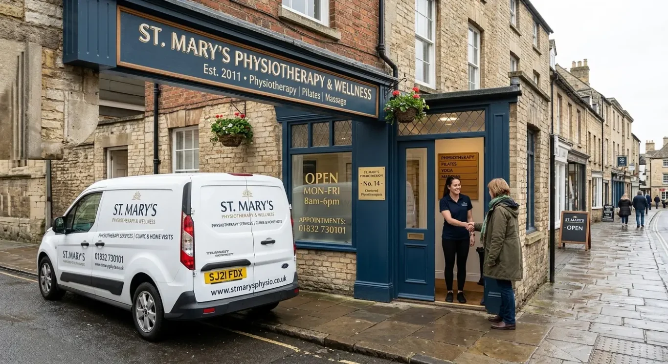
Not every new business needs physical branding straight away, but if customers meet you in person it matters. A shopfront sign, office sign or door plaque can help people find you and judge your professionalism before they even speak to you. Inside the space, simple branded signs such as reception boards, room names or wayfinding – signs that help people navigate – can make the experience feel clearer and more organised.
Useful if you work on the move
If your business travels to clients, vehicle graphics can turn everyday journeys into local visibility. They do not need to be complicated. Usually, your logo, business name, website and contact details are enough, as long as they are easy to read. The same goes for workwear or uniforms if staff visit customers, attend appointments or work on site. Branded clothing helps your team look consistent and makes it easier for people to recognise who they are dealing with.
For networking, exhibitions and pop-up spaces
Event materials are worth preparing if you plan to exhibit, sponsor local events or run temporary displays. This could include pull-up banners, display stands, tablecloths, posters or simple printed boards. These items often have to work quickly in busy spaces, so keep the design clear and focused on your name, offer and contact details. If planning rules or landlord approval apply to exterior signs, it is sensible to check that early, but from a branding point of view the main goal is clarity and consistency.
Whatever physical items you use, they should match the rest of your brand. The same logo version, colours, typefaces and tone help people connect the dots between your website, printed material, social media and real-world experience. When everything looks related, your business feels more established and easier to trust.

Packaging and labels if applicable
If you sell physical products, packaging is part of the brand experience from the first look to the moment the item is opened.
Not every new business needs packaging, and many service-based businesses can skip this section for now. But if you sell products, packaging design should be on your branding checklist early. The box, sleeve, pouch, bottle or wrap people see first often shapes their opinion before they have used the product itself. Good packaging helps your business look considered, makes products easier to recognise, and supports repeat buying when customers remember what to look for.
Keep it clear as well as attractive
Product packaging design needs to do more than look good. It should use the same logo, colours, typefaces and tone as the rest of your brand so everything feels connected. At the same time, it must be easy to read. Labels and stickers should clearly show the product name, key details and any required information, with enough space allowed in the layout from the start. Tiny type, crowded panels or low-contrast colours can make packaging feel less professional and harder to use.
Do not forget delivery and transit packaging
If products are posted or delivered, the outer packaging also matters. Mailing boxes, envelopes, packing slips, thank-you cards and address labels all contribute to the customer experience. They do not need to be expensive or over-designed. Even simple transit packaging can feel branded and consistent if it uses the right logo version, colours and messaging. This is especially useful for small businesses where the delivery experience may be one of the main physical touchpoints customers have with the brand.
A practical checklist here is simple: decide what type of packaging you need, what size and format each product requires, which labels or stickers are necessary, and what information must appear on them. Then check that the design is legible, consistent with your wider branding, and suitable for both shelf presence and delivery if relevant. Done well, packaging helps a new business look more established without making things complicated.

Imagery, photography and graphics checklist
Supporting visuals shape first impressions and often say as much about your business as the logo itself.
Your brand is not only built through logos, colours and typefaces. The images you use matter just as much. A new business should decide what sort of photography style fits best, whether that is candid and natural, polished and professional, product-focused, or people-led. The goal is not to copy what others are doing. It is to choose a visual approach that matches your offer and the way you want people to feel when they come across your business.
Choose a visual style and stick to it
If you use illustrations, icons or graphic elements, these should feel like part of the same brand too. For example, clean simple icons will give a very different impression from hand-drawn illustrations. Whichever route you take, keep image quality high and the overall look consistent. That means avoiding a mix of dark moody photos, bright product shots and generic office images all in the same set. Random stock images are one of the quickest ways to make a business feel less considered, especially when they do not reflect your real audience, service or tone.
Know when custom photography is worth it
Not every business needs a full photo shoot straight away, but custom photography can be a smart investment when trust is important. This is often the case for service businesses, founder-led brands, hospitality, interiors, professional teams and product-based businesses where customers want to see the real people, place or product behind the name. Even a small set of well-planned original images can go a long way on your website, LinkedIn page, brochures, proposals and social posts.
As a practical checklist, decide on your photography style, note any illustration or icon style, set a basic standard for image quality, and create a short list of approved visuals to reuse. Then apply those choices consistently across your website, printed material and social media templates. When the same visual language appears everywhere, your brand feels clearer, stronger and far more professional.

Brand consistency across every touchpoint
Use this final check to see where your brand shows up, spot anything that does not match, and tidy up the gaps.
The easiest way to do this is to list every place a customer might see your business: website, email, printed material, social media, signage, packaging and everyday documents such as proposals, invoices, presentations and letterheads. Then review each one quickly. Check that your business name is written the same way, the correct logo is being used, colours feel consistent, and the tone of voice sounds like the same business throughout.
Look for old versions
If you have recently launched, refreshed your logo or refined your positioning, older materials can easily get left behind. That might be an outdated email signature, an old social media header, a PDF with a previous logo, or printed items still using former colours or wording. You do not need to change everything at once, but it helps to make a simple list and update the most visible items first.
Keep approved files together
Store your approved logo files, colour references, fonts, image choices, templates and brand notes in one organised place that is easy to find. A clearly named shared folder is often enough. This saves time, reduces guesswork and makes it less likely that someone will grab the wrong file when a quick deadline comes up.
Where possible, ask one person in your business, or one trusted designer or supplier, to keep an eye on consistency across the main touchpoints. That does not mean your brand has to feel rigid. It simply helps everything look joined up and intentional, so your business appears more professional from the start.

What to prioritise if time and budget are tight
Start with the items you need to look credible at launch, then add the rest in the order customers are most likely to see them.
If you are trying to get your business out into the world quickly, focus on the first wave only. In most cases, that means a logo system, your core colours, typography, a short brand guide, website basics and a few key templates. A logo system simply means having the right versions of your logo for different uses, such as full logo, stacked logo and icon if needed. Your short brand guide does not need to be complicated. It can be a simple document showing logo rules, colours, fonts, image style and tone of voice so everything starts off consistent.
Prioritise by first impression
The best way to decide what comes first is to look at where customers first meet your business. If they find you through Google, your website basics matter early. If you win work through networking, proposals, email signatures and business cards may be more useful. If people discover you on LinkedIn or Instagram, branded social media templates could move up the list. If you have a physical location, signage may need attention sooner. Build around the touchpoints that affect trust and buying decisions first.
Add the second wave when there is a clear need
Once the essentials are in place, move to the second wave: printed materials, signage, packaging or any extra collateral that suits your business. Not every new business needs all of these straight away. A consultant may need a polished proposal template long before any signage, while a food product may need packaging early because it sits directly in front of buyers. Let real business use guide the next steps rather than feeling you must order everything at launch.
In practice, fewer well-made items are almost always better than a long list of rushed ones. A clear logo system, a simple website, and a handful of consistent templates will usually do more for credibility than lots of mismatched extras. You can build your brand step by step as the business grows. The important thing is to keep each new piece aligned with the choices you have already made, so the whole brand feels joined up from the start.
FAQ
Words from the designers
We often see new businesses put real effort into individual brand items, then lose consistency when those items start being used in day-to-day work. A common problem is different logo files being sent around by email and then used at random, which quickly makes the business look less settled than it really is.
If time and budget are tight, our calm judgement would be this: get the core brand pieces right first, and only add the extras when there is a clear business need for them. A smaller brand system used consistently usually does a better job than a bigger one that feels unfinished or disconnected.