LOGO
DESIGN & BRANDING
Services
Your logo and branding are vital parts of how your business is seen. A logo isn’t just a visual element; it’s how you communicate your identity to your audience. We understand the importance of creating a unique symbol that captures what your business stands for.
With experience working with diverse brands – from supermarkets and sports teams to nightclubs and shops – we create memorable logos that truly represent your brand.
LOGO & BRAND IDENITY WE CREATE

Memorable
When creating a logo design, we aim to develop a unique and memorable emblem that will leave a lasting impression on people’s minds. It’s important to have a logo that people can easily recall, as it plays a key role in building brand recognition and awareness.
01

Elegant & Stylish
The majority of successful logos are characterised by their simplistic, elegant, and eye-catching designs, which are easily recognisable and memorable. Our goal is to craft an elegant logo for you, be it abstract, mascot, retro, or letterform, with the purpose of aiding your brand’s distinctiveness and recall value.
02

Timeless
Logo design plays a crucial role in representing a company’s brand identity, and it’s important to ensure that they stand the test of time. A timeless logo should be designed to remain relevant and effective in representing the company throughout its entire existence.
03
HOW YOU CAN USE
Your Logo
Hundreds of
UNIQUE LOGO DESIGNS CREATED
This is just a small glance at the logos we’ve designed over the years. We hope you find inspiration in our style and ideas, and we’re excited about the possibility of working together on future designs.
Why choose
GRAPHIC DESIGNER 2B
Our team has been in the business for over 19 years and has grown to include designers, web developers, photographers, copywriters, 3D designers, as well as SEO and SEM experts. We stay up to date with the latest trends and technologies to create visually stunning projects. Keeping to deadlines and budgets is a top priority for us. We always make sure that our work aligns with our clients’ corporate image to maintain consistency.

WE LOVE WHAT WE DO
The first and most important thing – we love what we do! It’s not a job – it’s a passion, and we treat every project that comes to us with love and affection.

UK BASED DESIGNERS
No cut corners here – we are a local London-based graphic designers. We provide the best design, branding, and marketing in the UK and worldwide.

EXPERIENCED STAFF
With over 19 years of experience, we have proven ourselves to be a reliable partner in improving the business and presentation of clients from various industries.

FEEL SAFE & RELAXED
Leave it to us! We strive to ensure our clients are satisfied and stress-free with our work, whether it’s a logo, website, label or magazine design project.
What
YOU ARE GOING TO GET

UNIQUENESS
GUARANTEED
At 2BDesigner, we pride ourselves on creating bespoke logos tailored to each individual client. Whether through hand-drawn, watercolour, or vector-illustrated techniques, we guarantee that every element and typographic detail is entirely unique and customized to suit each customer’s specific requirements.

LOGO
COPYRIGHTS
Upon completion of the project and receipt of all payments, the client will be entitled to the full copyright ownership of the created logo. This transfer encompasses all related rights, including but not limited to reproduction, distribution, and commercial usage.

VECTOR
FILES
The logo design will be delivered in high-quality vector formats, including PDF, SVG, JPG, PNG, Webp, and Adobe Illustrator open files intended for website use while adhering to the specified colour palette guidelines. Additional formats can be provided as needed.
Logo design
PRICES
How much will logo design cost me? We charge less than you would expect for logo design in London.
Even in exchange for the best logo design services, we keep our prices affordable. Additionally, we will save your logo in all formats available. With us, you’ll get a finished logo that is 100% unique, beautifully designed to the point, and ready for any media.
All logo requirements are unique. For the exact logo design quote please call us 07546 681 556 or fill in get a quote form.
CONTACT US
To get a logo design quote
To get quick logo design quote please fill in the form below.
If you want to ask a question or speak directly to the team, please call us 07546 681 556
Choose the right
LOGO DESIGN STYLE
When choosing a logo, various elements come into play, from colours, shapes, and graphics to typography. If you identify each component and understand what it can do for your logo, you can take things step by step rather than getting overwhelmed by the whole design at once. Choosing the right design aesthetic for your brand should be your first step in designing your logo. Only your brand can determine what logo style is right for it. There is no right style for everyone.
CLASSIC
Although trendy logos can be fun and exciting, they can quickly become dated. A classic style can help you connect with a broader audience and ensure long-term success. This style keep things simple without going overboard with crazy color palettes, graphics, or fonts. The classic style logo shows that you are trustworthy, reliable and simple to work with.

RETRO or VINTAGE
The reason why vintage and retro logo designs have been popular for quite a while now is quite evident. Not only do they bring back memories of the past, but they also evoke feelings of nostalgia. When you use a vintage logo design, you’re telling your customers that history is important to you. This aesthetic works beautifully with logos in brown and beige colour palettes.

MODERN & MINIMALIST
To show how modern and fresh their company is, businesses often choose a clean and minimalist logo design style. Simple, clean lines, lots of whitespace, and minimal details provide this style with a sleek, pared-back appearance. When you choose a minimalist and modern logo design, you show your customers that your brand is contemporary, cool, and knows what’s important.

FUN & QUIRKY
For brands that are targeting a younger audience, this is a popular choice. Logo design styles that are fun and informal are usually colorful and cute, incorporating symbols or illustrations to create a positive and friendly atmosphere. Let your brand’s fun character shine through with a whimsical mascot or illustration.

HANDMADE & HANDCRAFTED
A handmade logo style style sends a clear message: this brand stands for individuality and quality. It works well in combination with other aesthetics, like vintage, to convey the message effectively. However, it can also be combined with minimal and more fun logos for a stylish look that is both sophisticated and youthful.

CAN’T CHOOSE JUST ONE?
It’s fine to mix and match these styles based on your brand: they aren’t mutually exclusive. A brand can be both handmade and fun at the same time. Tell us more about your business and we will come up with some fantastic ideas.

Choose right
LOGO TYPE
In any online business, the logo is a crucial aspect, as it is what gives your brand its identity. Graphics should not only be able to communicate your brand’s exclusive offer and ethos, but also be instantly recognizable among other types of logos. With your business growing, your logo will appear on everything from your email marketing to your advertising posters.
Each day, we see brand logos everywhere, so it’s easy to forget just how hard it is to create them. There are many types of logos, and each one makes a different impression on your target audience, customers, and business partners. There are different types of logos, and each is different in how it uses words and images. This section will cover different types of logos and show examples of how they are used by different kinds of brands.
01 BRAND MARKS
An icon or graphic symbol that represents a real-world object is what makes up a brand mark or pictorial mark. Like the outline of a car or an air balloon, this logo icon is straightforward and simple. You should use this object to explain what your company does.
BRAND MARK LOGO DESIGN ADVANTAGES
Easily recognizable brand marks are simple and easy to remember. Using an image that represents what you offer will send a quick, clear message to your audience. The simplicity of the design will translate well when resizing your logo across branding materials.
IS THE BRAND MARK LOGO DESIGN SUITABLE FOR ME?
What is one thing your business does exceptionally well? Creating a brand mark logo could be a great choice for your business if you specialize in one product or service that can easily be represented by a single image. You may also use a brand mark for your business if it represents a real-world object, such as an apple.
THINGS TO CONSIDER
In order to establish yourself as an iconic company, you need to be well-established enough to be recognized by your brand mark. New businesses or those with few followers should choose brand marks carefully. In that case, your logo will fail to communicate enough about your company to your audience, and they’ll lose interest in you. Additionally, if you plan to expand your product line to include a few diverse items, your logo might misrepresent your brand.
02 ABSTRACT LOGO
Like brand marks, abstract logos are composed of just a symbol, but they are tailored to your business. Logos with abstract designs are based on concepts and are designed with the long term in mind. It’s a unique logo that’s designed to express something unique about your brand, not necessarily an object found in real life. You can use these designs to create a logo that communicates your values or highlights something about your brand.
ABSTRACT LOGO DESIGN ADVANTAGES
Abstract logos don’t have to be based on real objects or images, so you can say whatever you want about your business.
SHOULD I USE AN ABSTRACT LOGO DESIGN?
You might find an abstract mark the perfect logo for your business if you do several distinct things. In order to differentiate your business from others, abstract designs are great for communicating your brand values. If you plan to do most of your branding online, a simple abstract logo will do fine, since simple designs translate well regardless of size.
THINGS TO KEEP IN MIND
A logo design that’s too vague or difficult to understand can misconstrue your message, so it’s crucial to pay attention to details. Your logo design should be refined until you’re confident it conveys the intended message. Have you ever noticed how easy it is to recreate the Pepsi logo from memory? Additionally, a logo that has excessive detail may not look the way you want when printed at different resolutions; therefore, consult a logo designer who knows how fonts, colours, and shapes interact.
03 MASCOTS
An ideal family-friendly logo, mascots are images of characters or people that represent your business visually. Consider mascot logo design your brand’s spokesperson – most of your advertising will focus on them.
MASCOT LOGO DESIGN ADVANTAGES
With mascots, brands are able to create a distinctly memorable brand by giving their audience a warm-and-fuzzy feeling. In addition, kids love physical, tangible characters they can relate to and they will prefer to eat in restaurant with well known mascot logo on it.
MASCOT LOGOS CAN BE USED
For brands aiming to appeal to children, these are great choices. There are many companies that use mascots – like McDonald’s and KFC – as well as brands that want to simplify complex concepts, such as Mailchimp’s marketing automation platform. When you offer a product or service that’s a little harder to understand, such as a software as a service (SASS) or car insurance, a mascot could be a great way to humanize your brand and make it more appealing.
THINGS TO CONSIDER
Be aware that Mascots may not convey the right message if your company is focused on global innovation or you are marketing a product that is not child-friendly.

04 COMBINATION LOGO
Logos that combine images and words are known as combination logos, as their name suggests. Using a combination mark logo allows you to combine images and words in any way you like – for example, you can pair a letterform with a mascot or a monogram with an abstract image.
COMBINATION OF LOGO DESIGN ADVANTAGES
There is only one word to describe combination logos – versatility. It gives you the opportunity to convey a clear, memorable brand message using both symbols and letters. You can also rebrand easily with this combination – your company name, for example, will be associated with an image, so that your customers will eventually only see the symbol and still think of your brand.
COMBINATION LOGOS CAN BE USED
This type of logo is definitely worth considering if you’re just starting a new business. The use of combination marks helps your audience remember you – and what you do – over time because they give them multiple visual cues. Combining symbols with text will help you to create a distinctive image if you want to trademark your logo.
THINGS TO CONSIDER
Consider how your business name and symbol will work together, and keep your logo design clean and message-oriented.
05 EMBLEM LOGOS
Even the name evokes a sense of tradition and elegance. Throughout history, emblems have stood the test of time, from family crests to royal stamps. There is usually a seal or crest around the logo, and the typeface sits within the border. University and government organizations come to mind.
EMBLEM LOGO DESIGN ADVANTAGES
You can add professionalism, traditionalism, and importance to your brand with emblems. Additionally, they give the impression that your company has been around for a long time and won’t be going anywhere anytime soon.
EMBLEM LOGOS CAN BE USED
If you want your brand to seem reputable or convey to your audience that you are upholding traditional values, then this logo type is perfect for you. It may be a good option for you if your organization has uniforms or garments of some kind, as engraved emblems look particularly prestigious.
THINGS TO CONSIDER
As you design your emblem, keep scalability in mind, since these logos typically have more detailed designs that may not look as good when resized. Be absolutely certain about your logo design before sending it out into the world, as emblems don’t offer the same level of flexibility as traditional combination marks.


06 DYNAMIC MARKS
In some ways, dynamic marks can be described as new-age logos. These types of logos adapt themselves to the context in which they are used. Therefore, rather than having a fixed font colour and text combination in your logo, these elements can change – whether on the internet or on different branding materials.
DYNAMIC LOGO DESIGN ADVANTAGES
Your logo can be used in a variety of ways, so you can be creative however you like. Among them are responsive web pages, mobile sites, blogs, digital media, merchandise, and advertisements. A dynamic logo design can be modified to fit any scenario or to make a wide range of impressions on potential clients. Additionally, dynamic logos keep your audience interested – they’ll wonder what you’ll come up with next.
DYNAMIC LOGOS CAN BE USED
Brands in entertainment, media or creative industries should consider this option. A dynamic mark could be a great way to differentiate your business’s branches from each other if you have several, like FedEx.
THINGS TO CONSIDER
Make sure your logo doesn’t lose its associative power. When your logo is constantly changing, it may not provoke the same effect as a static logo if some of your followers associate your brand with your colours, while others may recall the shape of your icon. Always keep your logo’s message in mind when making changes.
07 WORDMARK LOGOS – LOGOTYPES
A wordmark logo consists only of text – a company name, monogram or initials. The essence of a logotype is just the name of the company set in a certain font.
WORDMARK LOGO DESIGN ADVANTAGES
There’s no need for the user to guess what company the logo represents when they see a wordmark. As logotypes are all about lettering, they are extremely versatile and can be applied to a variety of marketing materials.
LOGOTYPES CAN BE USED
A catchy business name is a perfect way to highlight it and use it in your branding strategy. The use of wordmarks is common among high-end fashion brands like Tiffany and Co, as well as food brands and tech companies that want to be seen as innovative. Because wordmarks’ power lies in their fonts, you can pick a font that reflects your brand’s personality – and your audience’s eyes will be drawn right to your logo.
THINGS TO CONSIDER
Can you tell what your business does by its name? If the answer is yes – the wordmark logo design is the perfect choice for you. The use of a logotype might be harder if you aren’t well-known, or if your company is named after a person rather than a concept.

08 LETTERMARKS – MONOGRAMS
The lettermark or monogram logo is a typography-based logo that spruces up a company’s abbreviated initials. Unlike typography-based logos or wordmarks, letter marks consist only of the company’s initials. Additionally, it is extremely important to select the right font when designing a letter mark since the first letters must remain the focus. It is often chosen by companies because the initials of the company are easier to visualize than the full name of the company (too long), difficult to pronounce, or not distinctive enough to carry its own weight.
LETTERMARK LOGO DESIGN ADVANTAGES
In today’s technological age, abbreviations are probably more popular than ever. Today, acronyms are everywhere – from personal communication – LOL, BTW, OMG – to car companies – MG. Furthermore, lettermarks make your lengthy company name into an identifiable brand.
LETTERMARKS CAN BE USED
Getting this logo up and running is relatively easy – there aren’t many details to worry about – so monograms are a great option for new/small businesses. A lettermark is also a good choice if your business name is long and difficult to print on small objects or read on a small scale. Lastly, since monograms are often associated with wealth and personalization, they are a good option for brands that cater to the high-end crowd or offer homemade products.
THINGS TO CONSIDER
Make sure your logo design isn’t boring and forgettable; the appeal is in the details. Make sure the logo is simple, yet memorable. Additionally, you may want to consider embossing your business’s full name under your logo on branding materials (such as business cards or a landing page) so that people can associate your monogram logo with your company name.
09 LETTERFORM LOGOS
Letterforms are the minimalist versions of monograms – they are simply one-letter logos. Unlike most logo designs, letterform logos focus exclusively on a single letter. You can also use a lot of style with a lettermark to send a clear message to the customers. Obviously, these logos should be bold, beautiful, and very well designed, as a letter alone cannot convey a clear business message.
LETTERFORM LOGO DESIGN ADVANTAGES
Scalability is easy with letterform logos. Having just one letter in your logo allows you to stick it anywhere and have it look equally good. In addition, people will subconsciously associate your brand’s full name with a well-designed letterform.
LETTERFORMS CAN BE USED
A logo with letterforms can stand out while still hinting at your business name if you have a long and complicated business name. By using the perfect font, you can make your letterform represent something you offer.
THINGS TO CONSIDER
Due to the fact that these logos are just one letter, the design is crucial. There is no point in having a letterform logo design if it isn’t memorable. It might have a funky font, a dramatic backdrop, or an interesting colour scheme – anything to make the letter stand out. Ensure that the font you choose is readable as well. People need to be able to read your logo even if it consists only of one letter.
LOGO VARIATIONS
Every Brand Identity Needs
People commonly associate brands with logos, but brands are not just logos. Despite its visual expression, your logo does not represent your brand in its entirety. After trying to implement that single logo, you’ll quickly realize that you need quite a few more to represent your brand. Requesting just one logo design service won’t do the job right. Four core logo design variations are needed to make your brand stand out and sell well.
As you searched for logo design services, you probably encountered terminology like submark and alternate logo that left you confused. Graphic designer 2B will simply explain the four different logo variations, with visual examples, that every brand needs to complete its identity.
WHAT IS LOGO VARIATION?
Logo variations are not wildly different visual designs; they are rearranged versions of your primary logo design that give your brand the flexibility to appear consistently and recognizable in different placements. Each brand needs a set of recognizable, versatile, and complementing logo designs that can be used across several platforms.
Suppose you only have one large horizontal logo, how will it work as the profile photo on your social media business page? In addition, what will you use as your website’s header if you only have one small circular logo? How about business cards or thank you notes? It is important to remember that every brand requires four main variations of its logo. They can come in a variety of sizes, colours, and formats. In order to ensure your brand shows up and looks consistent no matter where you place it, our logo designers will design you at least four non-negotiable logo variations. Here are the different logo variations your brand needs.
01 PRIMARY LOGO
The primary logo serves as the main representation of your brand – all other logo variations follow this primary design. Most primary logos are horizontal and include the most information. Usually, this logo includes any taglines, established dates, or illustrations.
Because of its complexity and size, your primary logo design requires a lot of space. Ensure your main logo has plenty of room to breathe and is not constrained by space. Can be used for desktop website headers or large print collateral.


02 SECONDARY LOGO
Also known as an alternate logo, your secondary logo is another way to identify your company. If your primary logo does not fit or cannot be used, an alternative logo design can be applied.
Vertical or horizontal logos can be created depending on your business industry. Your alternative secondary logo is usually a stripped-down, stacked, more compact version of your primary logo. Secondary logo designs usually do not include any creative elements or taglines, focusing instead on the brand name.
Hang tags for clothing brands work well with vertical secondary logos, while smaller print collateral works well with horizontal versions. Also used for invoices, business cards or mobile website header.
03 SUBMARK LOGO
Submark logos also referred to as brand marks or alternate marks, are simple, small, but recognizable designs. In some designs, the submark features the full business name or a creative element. Submarks that use only your brand’s initials are called lettermarks. A submark works in condensed spaces where a larger logo variation would not fit.
While reducing a large primary logo to a tiny submark can be challenging, the result is an extremely versatile and creative variation. Can be placed in the website footer, social media posts, and small print pieces.

04 FAVICON
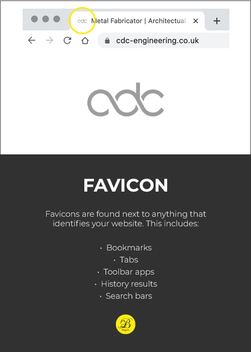
In most cases, favicons go unnoticed until they are missing. Think of it as a brand icon. A favicon is like a submark, but even smaller, as it only includes your brand’s initials or a small illustration.
On your computer, do you see the branded icons in the left corner of all the tabs you have open? Typically, those are square or circular mini-marks called favicons. A favicon is used to add a final branding touch to a website. If a website doesn’t have a branded favicon, it displays a generic icon which just looks tacky.
We always create and use favicon logo variations for our web design projects and will provide you with one when you’ll use our logo design services.
MOST IMPORTANT STEPS
To design a perfect logo
Has a big brand ever existed without a logo? There is no well-known brand without a logo! Your brand’s logo has a significant impact on how customers perceive you. It is natural to want it to stand out, be memorable and well known.
Here are the steps you need to know to design the perfect logo for your business. Here’s everything you need to know about how to design a logo, from defining your brand’s identity to understanding what makes a great logo to making the right choices and navigating the design process.
01 UNDERSTAND WHY YOU NEED A LOGO
In business, you’re trying to attract the right customers and make them fall in love with your brand. The logo you choose for your business will have a huge impact on how your business is perceived. There should be something intriguing and interesting about the logo that makes people want to learn more about you.
A logo is one of the most important parts of your brand, so make sure it is done well. Your logo will appear on all your branding materials. Your website, packaging, and business cards will all reflect back at your customers. The power of a great logo design lies in its ability to reflect who you are and what you stand for. Additionally, it will help you stand out from the competition and make a good first impression.


02 DEFINE BRAND IDENTITY
The logo should reflect the personality of the brand. You must first understand your brand’s core personality in order to accomplish that. Making logo design choices that complement and complete your brand will be much easier once you know what makes you unique and what your brand is all about.
To figure out your brand identity, ask yourself these questions:
03 FIND INSPIRATION FOR LOGO DESIGN
Finding logo inspiration can be the most challenging part of the design process. Here are some tips that will make it much easier.
If you have a conceptual mind, you may like to begin by collecting verbal ideas. Brainstorming is a great way to nail down the look and feel you’re going for. Get all your ideas out and write them down (even the really, really bad ones). The most horrible idea can spark a conversation that leads to a brilliant solution.
Create a list of words that describe your brand and how you want people to perceive it. Try to think like a person in your target demographic and consider what would be important to them. Everyone needs to participate: You can have a one-person brainstorm, but diversity makes the magic happen. Invite people from all departments or even friends and business partners.
Think outside the box when brainstorming your logo and don’t be afraid to be a bit different.
To get inspired, you might benefit from a mood board if you are a visual person. Printed images can be cut out and pinned to a board, or you can make a digital one.
If you collect all the images you feel drawn to, your mood board will reflect your style and design preferences in no time. These can be other logos, colour combinations, illustrations, or graphics. All of these elements can be gathered together on your mood board to design the perfect logo combination.


04 IDENTIFY YOUR DIRECT COMPETITORS
Your competition is the best place to get logo ideas! Look into what’s already on the market, what works well with your audience, and what you should avoid. Think about how your logo design can emphasize the differences between you and those other businesses.
Make sure your logo design clearly distinguishes you from your competitors. Consider using some colour to stand out if all the other businesses in your industry go monochrome. A fun, modern logo might stand out if everyone else is traditional.
05 CHOOSE LOGO DESIGN STYLE
Choosing the right design aesthetic for your brand is the first step toward creating a good logo. The right style depends on your brand, not on what’s best for everyone. Logos can be categorized into 5 basic styles, each of which has its own strengths and weaknesses.
We have created detailed instructions on where to use each logo design style. You can find it here.


06 FIND THE RIGHT TYPE OF LOGO
In addition to the overall style, there are 9 main types of logos you can choose from when you are creating your logo. You can pick the one that suits your company name or overall aesthetic best, or combine them to create something unique.
Logo types
You can find detailed information about each logotype here.
07 SELECT THE RIGHT LOGO COLOURS
There are a lot of different meanings attached to colours. Certain emotions and ideas are associated with them. Let’s learn more about colours so that we are aware of their meanings when it comes to logo design.
Red represents passion, excitement, and anger, and is a great choice if your brand wants to stand out, be loud, and be youthful.
Generally, green works for any brand and can be incorporated into any design. It’s perfect for anyone who wants to connect to nature.
Blue is a very classic and popular colour. Trustworthiness and maturity are symbolized by this calming, cool colour.
Choosing yellow will make your logo appear friendly and accessible. The energy of cheerfulness, affordability, and youthfulness emanated from it.
The orange colour is much less often used than red, but it has the same energy. Bright, invigorating, and playful, this colour is sure to get your attention.
Brown seems like a strange colour to choose from, but it works perfectly with rugged and masculine vintage logos. A handmade, unique, and aged look can be achieved with it.
A sleek, contemporary and luxurious look can be achieved with black. If you want to keep it simple, go for a minimalist black-and-white logo.
Looking for a clean, modern, minimalistic look for your logo design? Don’t be afraid to use lots of white. Despite being neutral, it adds a clean, youthful, and economical touch in combination with other colours.
The colour grey is the best choice if you want to achieve a mature, classic, and serious look. Lighter shades appear more accessible, while darker shades look more mysterious.
The colour purple can help your logo look luxurious. The colour purple can be mysterious, eclectic, or feminine, depending on its shade.
If you want to look girly, pink is the best choice. It doesn’t end there! Pink can give your logo a grown-up, yet youthful, feminine look with shades like pastel rose, millennial pink, or neon magenta.
If you want to tell a complete brand colour story, you can combine several logo colours instead of sticking to one monochrome logo. Your logo designer can assist you in selecting one or more colours for your logo to best represent your business.


08 PICK THE RIGHT LOGO FONT
Choosing the right font will complete and complement your logo. There are 4 basic types of fonts and hundreds of modern or unique ones you can work with to give your logo a unique look.
Serif fonts can make your logo design appear more classic and high-end due to the small “feet” at the end of letters. This type of font is very versatile and looks great with any kind of design, but it works particularly well with vintage, elegant, and classic styles.
A clean and modern logo look can be achieved with sans-serif fonts. Since they don’t have little feet like serif fonts, they look sleek and simple and work great for modern or online brands.
The use of script or handwriting fonts in your logo can make it look more individualistic and make it more memorable. There are many font styles to choose from, ranging from elegant calligraphic fonts to relaxed scripts.
The display fonts have a highly stylized appearance and are highly eye-catching. With the help of this font, you can create a logo that will stand out from others and will scream what your business does.
Combining different logo fonts can make your typography really powerful. Your logo designer knows thousands of fonts and how to combine them. Provide them with an idea of what you wish to accomplish and they will come back with the best font options for your logo design.
09 COMMUNICATE WITH THE LOGO DESIGNER
After considering all the necessary style points, it’s time to get started! There are many ways to get a logo, so you should consider which one suits you best. Logo maker or logo designer – different prices come with different qualities and both options have their pros and cons.
To make sure your design comes out perfectly, the first rule is to work with your logo designer and communicate clearly. By writing a clear creative brief, you can let your designer know who you are and what you need. If you want your design to be truly unique, make sure you provide them with as much information as possible about your company and your chosen logo style.
Try to stay open to suggestions from your designer, even if it takes a bit of trust. It’s important to remember that your logo designer is an expert who knows what makes a great logo for your business. It’s important to give designers lots of detailed and clear feedback if you want them to understand what you want. You and your designer will come up with the best design when you work together.

Having outlined all the elements of your logo, you need to ensure that they work together. Give all your ideas to the graphic designer to create the vibe you are looking for.
Final Thoughts
WHAT MAKES A GOOD LOGO
A good logo is instantly recognizable, reflects your brand’s message, and stands out from the crowd. An effective logo blends seamlessly with a brand’s identity and looks professional. Logos should also work at any size and anywhere you want to use them.


A good logo:
But how do you make a successful logo?
When considering your logo options, ask yourself these general questions:
There will be a huge difference between the logo requirements for a brand that sells work clothes and needs to have a simple logo that can be stitched onto fabric and a company that makes a high-tech app that people can download and use.
Whenever you are designing your logo, remember to take a step back and consider the bigger picture. You need to consider what works best for your brand, not what is good for your personal taste. This is the part where logo designers like us can step in and help you design the perfect logo.
Are you ready to design a perfect logo with us?
GET IN TOUCH
Let our experienced logo designers create a unique brand mark for you.
If you want to ask a question or speak directly to the team, please call us 07546 681 556

