
How Product Label Design Influences Buying Decisions
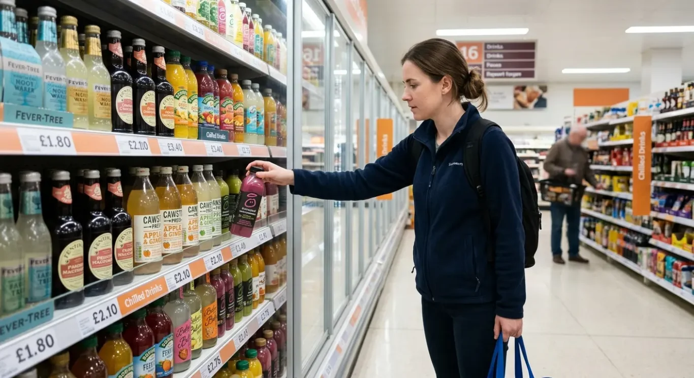
Most buying decisions do not begin with a careful read of the small print. They start in a rush – walking down a supermarket aisle, grabbing something from a corner shop fridge, or scrolling through product listings on your phone between meetings. In that first quick glance, a label does a lot of heavy lifting. It signals what the product is, who it is for, how it should feel and, importantly, whether it seems trustworthy enough to pick up or click on. This article looks at the practical design choices behind that moment, from colour and type to layout and shelf presence, and how they shape split-second decisions in food, drink and cosmetics.
Why first impressions matter on the shelf
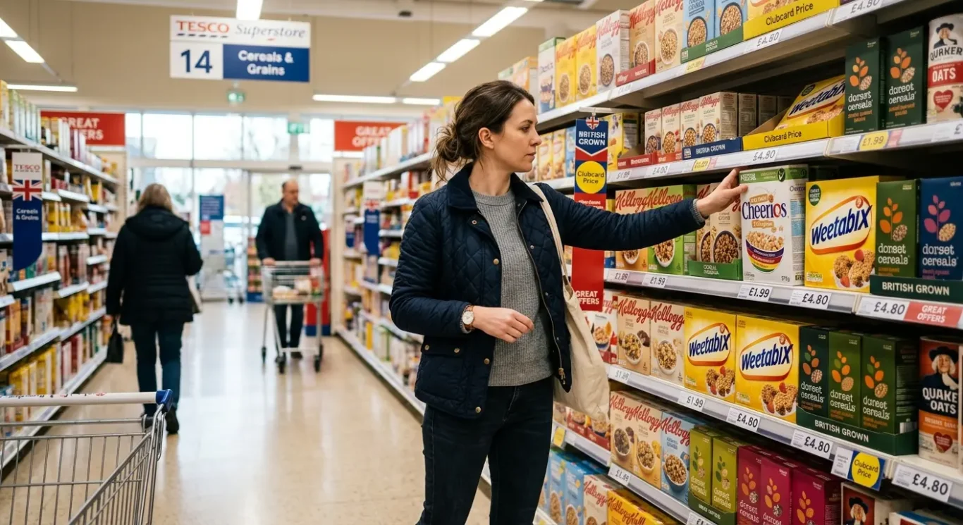
Shoppers often decide what to pick up in a moment, so the label needs to help them spot it, understand it and feel confident about it quickly.
In most shops, people are not studying every product in detail. They are moving quickly, comparing options at a glance and making small decisions under time pressure. That is why the label is so important. It is often the first real contact someone has with a product, and in that brief moment it needs to communicate enough to earn a second look.
A strong label helps shoppers do three things fast: notice the product, recognise what kind of product it is, and compare it with the alternatives nearby. On a food shelf, that might mean quickly seeing whether something is a premium pasta sauce or an everyday one. In drinks, it might be the difference between a craft soft drink, a fruit juice or a flavoured water. In cosmetics, shoppers often want to know straight away whether a product feels clinical, luxurious, natural or practical.
Standing out without looking out of place
Shelf presence is the product’s ability to catch the eye in a crowded space. Good shelf presence does not always mean being the loudest. A label still needs to feel right for its category. If a premium olive oil looks too playful, or a skincare serum looks too cheap, shoppers may hesitate. The best designs create enough contrast to be noticed while still matching what people expect from that type of product.
The same idea applies online. On a retailer website or marketplace, products are often reduced to small thumbnail images, where the label has even less time to work. Clear naming, strong contrast and an easy-to-read layout help people scan, recognise and compare products there too. Design alone will not guarantee a sale, but it can make the choice feel easier, quicker and more trustworthy.
Colour psychology: what shades suggest to buyers
How colour shapes first impressions, sets expectations and helps position a product on a busy shelf
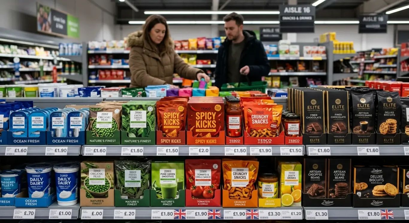
Colour psychology is the idea that colours influence how people feel about a product before they have read much about it. In packaging, colour can suggest mood, quality and even likely taste or texture. A shopper may not stop and think, “this blue feels trustworthy”, but they often react to it all the same. That said, colour does not have one fixed meaning. It works alongside the product type, the brand style and what people already expect from that category.
In food packaging, green is often used to suggest freshness, plant-based ingredients or a more natural feel, while rich browns, deep reds and cream tones can make a product feel hearty or indulgent. A dark chocolate bar in black and gold can feel more premium than one in bright primary colours, even if the ingredients are similar. In drinks, pale blues and whites are common for bottled water because they feel clean and crisp, while bold citrus shades on juices and soft drinks can hint at flavour and energy. Value ranges in UK supermarkets often use simpler colour systems and clearer blocks of colour to make products easy to spot and compare quickly.
Colour depends on context
The same shade can say very different things depending on where it appears. Black might signal luxury on a perfume box or premium skincare jar, but on a children’s snack it could feel too serious or heavy. Pastel tones in cosmetics often suggest softness, calm or gentle formulas, especially in skincare and bath products, while brighter tones can feel youthful or trend-led in make-up. In food, gold can imply quality, but if it is overused on a budget product it may feel less convincing. Good label design uses colour in a way that fits both the product and the buyer’s expectations.
Impact matters, but so does clarity
Strong colours can help a product stand out, but visual impact should never come at the expense of readability. If text disappears into the background or key details are hard to find, the design stops doing its job. This matters for accessibility as well as convenience. Clear contrast, readable type and sensible colour combinations help more people shop with confidence, whether they are scanning a supermarket shelf, checking ingredients in a hurry or viewing a product on a phone screen.
Typography choices and the personality of a label
The style, size and layout of the words on a pack help shoppers decide whether something feels reliable, current, premium or simply easy to pick up and understand.
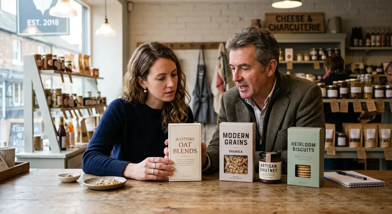
Typography simply means how words look in design – the choice of typeface, size, weight and spacing. On a label, these details do more than carry information. They shape first impressions. A clean sans serif style often feels modern and straightforward, while a more traditional serif can suggest heritage, craft or a premium touch. In practice, a craft drink might use bold, characterful lettering to feel independent and distinctive, while premium skincare often leans on refined, minimal type to look calm, controlled and high quality.
Style sets the mood, but clarity closes the gap
The right font style can support the brand personality, but it still has to be easy to read. Most buying decisions happen quickly, often with someone glancing at a shelf for only a moment. If the product name, flavour or key benefit is hard to scan, the design creates friction. That matters for everyday food products in particular. A pasta sauce, cereal or ready meal needs clear labelling because people are often comparing options fast, checking ingredients or trying to stay within budget.
Size and hierarchy matter just as much as font choice. Information hierarchy means showing the most important details first, in the clearest way. Usually that starts with the product name, then flavour, type or benefit, followed by supporting information. On a premium skincare label, the brand name may be small and discreet while the product purpose, such as cleanser or night cream, needs to be obvious. On craft beers or soft drinks, the name may take centre stage, but the alcohol content, flavour notes or pack size still need to be easy to spot.
Good label design finds a balance between being distinctive and being useful. A type choice can give a product personality, but if it becomes too decorative or cramped, it stops helping the buyer. The best packaging tends to feel considered rather than flashy. It gives enough character to stand out, while keeping the message clear for people who are busy, distracted and making a quick decision.
Information hierarchy: helping people find what matters first
Good packaging leads the eye in the right order, so shoppers can spot the key details quickly without having to work for them.
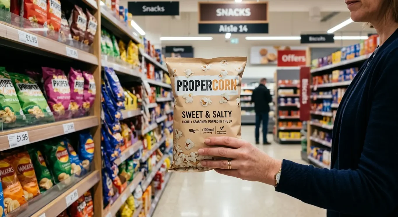
Information hierarchy means arranging content so the most important details are seen first. On a label, that usually starts with the product name, then flavour or variant, then a key benefit or purpose, followed by practical details such as size. Supporting information and legal wording still matter, but they should not compete with the main message. Designers use type size, weight, colour, spacing and position to create this order, helping people understand a pack at a glance rather than reading every line.
What people need to notice first
When someone is scanning a shelf for a few seconds, the label has to do a clear job. A ready meal needs the meal name to be obvious first, with the flavour or style close behind, such as chicken tikka masala or macaroni cheese. A bottled drink often puts the brand or drink type first, then flavour, with size and any key point such as sugar-free or sparkling made easy to spot. On cosmetic labels, the product purpose tends to matter most – cleanser, serum, body lotion – while skin type, fragrance or a key benefit can sit just beneath it. Size and legal details can be present without dominating, often placed lower down or in smaller type where they are available when needed.
This matters because most people do not study packaging in a calm, linear way. They compare, glance, reach and decide. If the visual order is unclear, the buyer has to pause to work things out, and that pause can be enough to lose the sale. In a chilled aisle, a busy shopper may only have time to check the dish, portion size and perhaps one reassurance point. In drinks, they may look for flavour and format first. In cosmetics, they are often trying to identify what the product actually does before anything else. Clear hierarchy reduces effort and makes the product feel easier to trust.
Enough detail, not too much noise
The challenge is giving people enough information without overwhelming them. Cramming every benefit, claim and detail on the front can make a label feel busy and harder to scan, even if the content is useful. Strong packaging chooses what deserves prominence and what can sit in the background until the shopper picks the product up. Legal information and technical wording still need care, but they do not all need equal visual weight. The best labels feel organised, not stripped back for the sake of it. They respect the buyer’s time by making the main decision points easy to find first.
Shelf presence without confusion
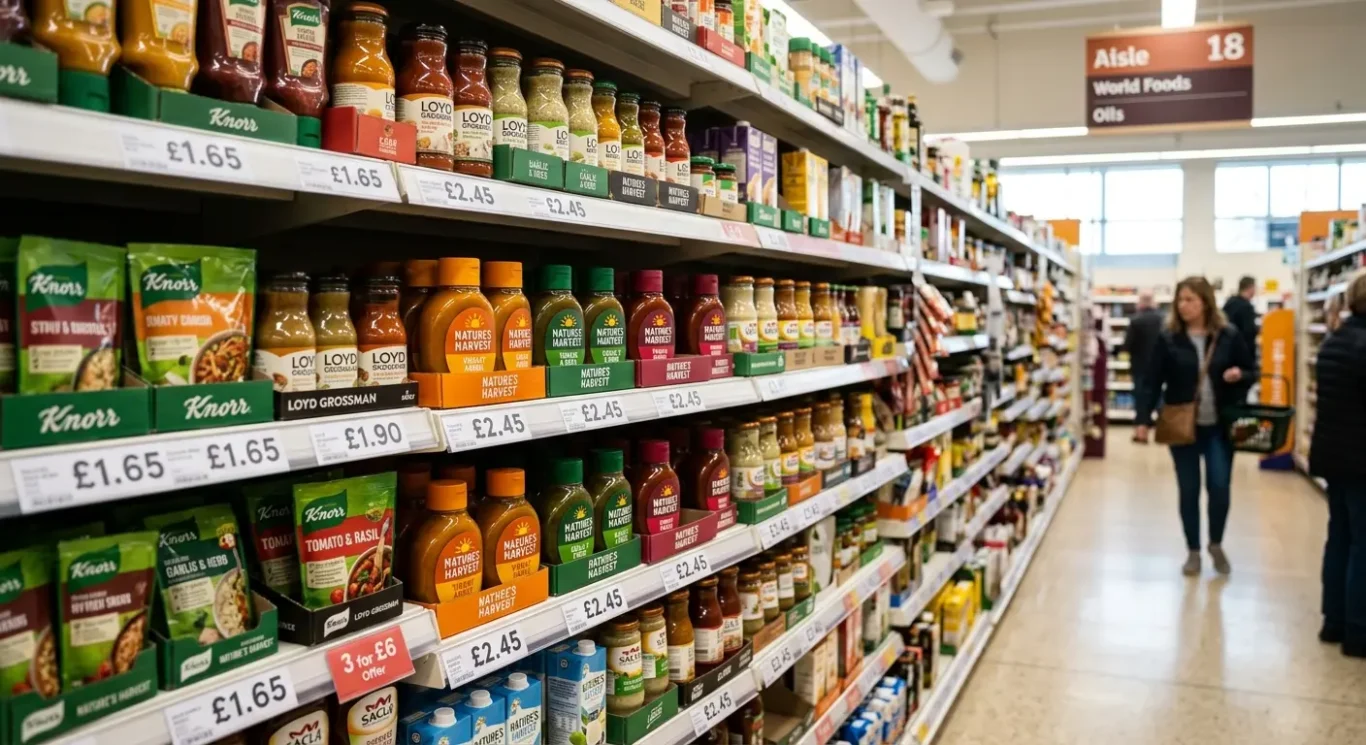
Good labels stand out quickly, but still look like they belong in the type of product people expect to buy.
Shelf presence, in simple terms, is how easily a product gets noticed and recognised when it is sitting among competitors. It is not just about being bright or bold. It is about being visible for the right reasons. Shape, clear colour blocks, strong contrast and familiar branding cues all help. A tall slim bottle may read differently from a short wide jar. A dark background with light text can catch the eye, while a consistent logo position or recognisable brand colour helps someone spot a product again on a busy shelf.
Different enough to notice, familiar enough to trust
If products look too similar to everything around them, they can fade into the background and become hard to remember. This often happens when brands follow category habits so closely that the pack feels generic. But going too far the other way can create a different problem. If the design breaks too many expectations, people may not understand what the product is, what level it sits at, or whether it feels credible. Busy shoppers do not want to solve a puzzle. They want quick reassurance that they are looking at the right type of product.
Food packaging often shows this balance well. A soup label might use cues people already associate with the category, such as a bowl image, appetising ingredient colours or a clear meal name, while still standing apart through a distinctive layout or brand palette. In drinks, a premium tonic or kombucha may use elegant typography and restrained colour, but it still needs to look like a drink first – not a perfume bottle or medicine. In cosmetics, shoppers usually expect cues linked to function and feel, such as clean layouts for skincare, softer palettes for body care, or more dramatic contrast for colour cosmetics. The brand can be distinctive, but the product purpose still needs to be obvious.
The best shelf presence usually comes from making smart choices rather than louder ones. A well-judged shape, a memorable colour area, clear contrast and consistent branding can create recognition without clutter. When the design fits the category but keeps its own character, the product feels easier to notice, easier to understand and easier to trust in that first quick glance.
How packaging builds trust before the product is tried
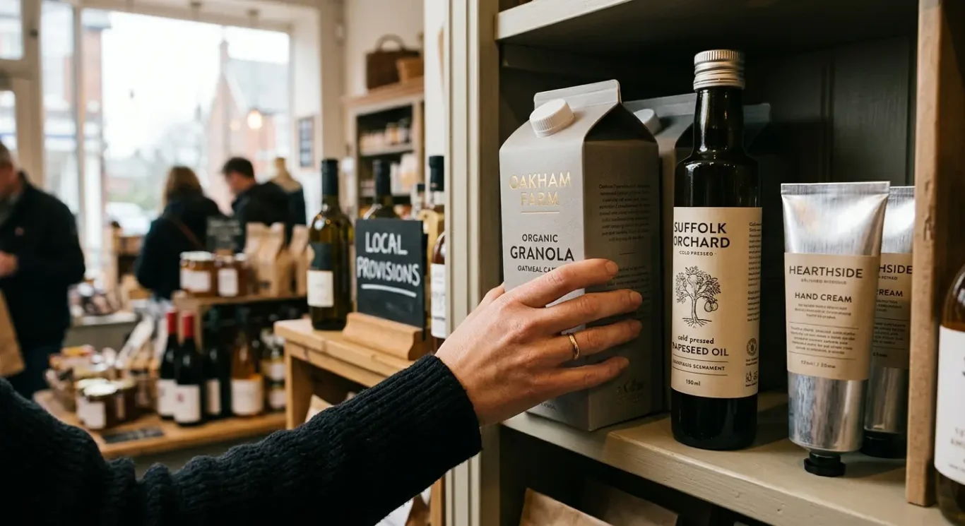
Buyers often judge quality, credibility and value from the pack long before they judge the product itself.
Before anyone tastes the drink, cooks the meal or applies the cream, the label is already shaping expectations. Materials, finish and print quality all play a part. A sturdy carton, a well-fitted label, a matt or gloss finish used with purpose, and crisp typography can make a product feel considered and reliable. By contrast, flimsy materials, poor alignment or crowded artwork can make even a decent product feel rushed. In food and drink, this might be the difference between a bottle that feels premium in the hand and one that looks anonymous. In cosmetics, a clean label on a well-made bottle often signals care and quality before the cap is even opened.
Clear design supports buyer confidence
People are more comfortable buying something when they can understand it quickly. A clear product name, an obvious variant, readable ingredients or key benefits, and a sensible layout reduce hesitation. This is especially important when shoppers are in a hurry and comparing several options at once. A simple, well-ordered olive oil label, for example, can feel more trustworthy than one covered in badges, claims and competing type styles. The same applies to skincare. If the product type, skin concern and basic usage are easy to find, the brand feels more transparent and easier to trust.
Consistency matters across every touchpoint
Trust also grows when the packaging matches the rest of the brand. If the website, advert, social content and printed marketing all use a similar tone, colour palette and visual style, the product feels more established. If they all say different things or look unrelated, confidence can drop. A premium soft drink with refined packaging but a messy website and inconsistent promotional material can feel less credible than a simpler brand that presents itself clearly everywhere. Consistency does not need to be flashy. It just needs to make the business feel joined up and dependable.
That said, design should support the real product, not disguise its weaknesses. A polished label can encourage a first purchase, but it cannot create long-term trust if the product fails to deliver. The most effective packaging sets the right expectation and then gets out of the way. If an organic soup looks wholesome and straightforward, the product inside should feel the same. If a cosmetic brand presents itself as clinical and precise, the formula and customer experience should back that up. Good design builds confidence because it feels honest, relevant and in step with the promise being made.
What different industries can teach us
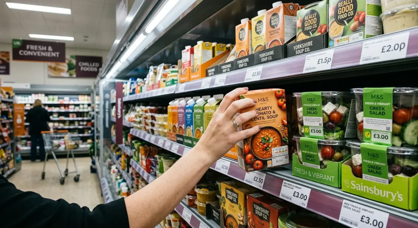
Food, drink and cosmetics all sell in different ways, so their labels prioritise different things.
Food packaging often has to do the fastest job. It needs to make the product look appetising, signal flavour clearly and suggest freshness at a glance. Colour, photography or illustration, and simple wording all help here. A soup label, for example, may lean on warm colours and ingredient imagery to feel comforting, while a salad pot may use cleaner layouts and fresher tones to suggest lightness. Food labels also need to make comparison easy, because shoppers often scan shelves quickly for flavour, format, dietary needs or meal type. The lesson for any business is simple: show the main benefit first, and make it easy for people to tell one option from another.
Drink labels often balance visibility with positioning
In drink, the challenge is slightly different. Some products need to feel premium, while others need to feel everyday, accessible and familiar. A premium bottle may use restrained colour, generous spacing and a more refined typeface to create a sense of quality. An everyday soft drink or juice may rely on bolder contrast, clearer flavour cues and stronger shelf standout so it can be picked out quickly. In both cases, clarity still matters. People want to know what the drink is, what flavour it is, and whether it feels like a treat, a health-led choice or an everyday staple. The lesson here is to decide how you want to be positioned before you design. Standing out is useful, but it needs to support the right impression.
Cosmetics buyers usually expect more reassurance from the label. They are often looking for trust, clear ingredients, product benefits and a sense of care. In some cases the design leans clinical, with neat typography and structured information to suggest expertise. In others it leans more luxurious, using elegant finishes, softer colour palettes and a calmer layout to suggest indulgence. Either approach can work if the information hierarchy is clear – in other words, the most important details appear first and the supporting details follow in a sensible order. The product type, skin or hair concern, key benefit and how to use it should not be hard to find. The broader lesson is that when people are applying something to their body, they usually want more confidence and more detail than they do with a snack or drink.
What matters most changes by sector because customer expectations change. Food is often about appetite and quick comparison. Drink is about clarity, choice and the right level of standout for the price point. Cosmetics are more about trust, benefits and emotional cues such as care or luxury. A business owner can borrow from all three. From food, take clarity and immediate appeal. From drink, take confident positioning and strong shelf presence. From cosmetics, take careful information order and a more considered tone. Together, these lessons help packaging do what it should do best: make the decision feel easier.
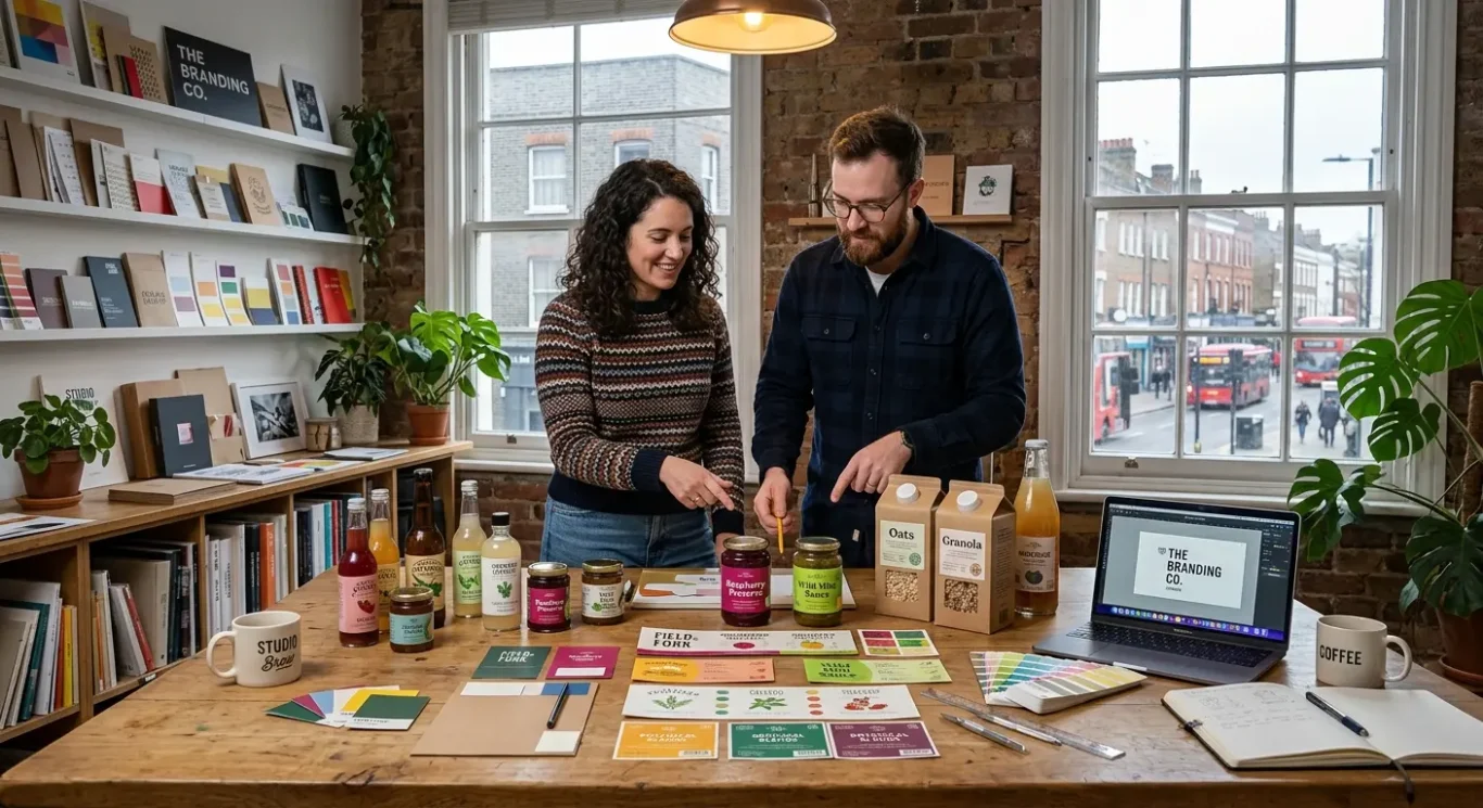
Practical label design tips for businesses
How to turn buying psychology into simple decisions when planning a new label or refresh
A useful place to start is with the buyer’s first question: what is it, who is it for and why choose it? If those three points are not clear within a quick glance, the design is asking too much of the customer. On a crowded shelf or a small mobile screen, people rarely stop to work things out. A food product should make the product type and flavour obvious. A drink should quickly show whether it feels premium, healthy or everyday. A cosmetic product should make the benefit and intended user easy to spot.
Clarity comes first
Prioritise clarity before decoration. Attractive details matter, but they should support understanding rather than compete with it. Keep the product name, main benefit and key point of difference high in the information hierarchy, which simply means the order people notice things. Use colour and typography to reinforce the message, not fight it. If the brand is meant to feel natural and calm, harsh contrasts and overly aggressive type can send the wrong signal. If it is meant to feel bold and energetic, a timid layout may disappear beside competitors.
Check it in the real world
Before signing anything off, test the design in realistic settings. A label that looks polished on a large presentation board can behave very differently when placed in a shelf mock-up, next to rival products, or reduced to thumbnail size on a phone. This is often where practical issues show up, such as weak contrast, text that is too small, or a layout that loses impact from a distance. Even a simple side-by-side comparison can reveal which version is easier to understand quickly.
It also helps to keep the look consistent with your wider brand identity and marketing materials. The label should feel connected to your website, brochures, advertising and other touchpoints, so customers get the same impression wherever they meet the brand. That does not mean every item must look identical. It means the colours, tone, type choices and overall style should feel like they come from the same business. Consistency builds recognition, and recognition makes buying feel easier.
FAQ
Words from the designers
We often see labels trying to say too much at once, and a common problem is that every message is given the same visual weight. When that happens, the pack has less chance of working in the quick, glance-based way people actually shop. One practical step we rely on is putting the design next to competing products in a shelf mock-up, so it is easier to judge what stands out, what disappears and what feels unclear.
If we had to make one judgement call, it would be this: clarity usually has more influence on buying decisions than decoration. A label can still feel distinctive and attractive, but if people cannot recognise the product, the benefit or the brand in a moment, the design is asking too much from them.