
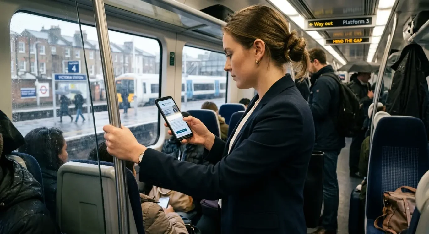
Mobile-First Design – What It Means and Why Your Business Needs It
For most businesses, the first visit to a website now happens on a phone, not a desk – often while someone is between meetings, on the train, or quickly checking a service before making contact. Mobile-first design simply means starting with the smallest screen first, then building up for tablets and desktops, rather than squeezing a full-size website down and hoping it still works. That matters because a site that is easy to use on mobile is usually easier for everyone to use, and it can also support search visibility in Google. In this article, we will look at what mobile-first really means, why it matters for user experience and SEO, and what to ask your web designer if you want your website to work properly where people are actually viewing it.
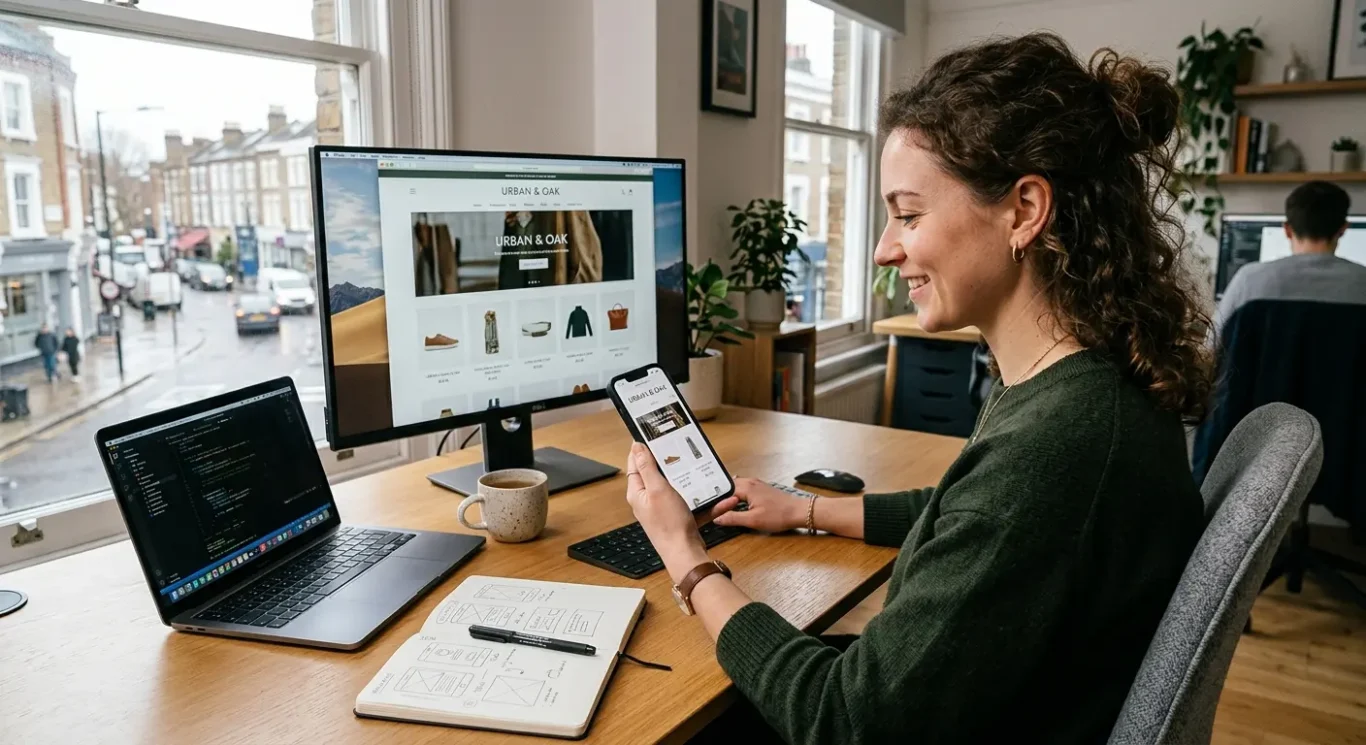
What mobile-first design actually means
In simple terms, it means planning the website for a phone screen first, then expanding it for larger screens.
Mobile-first design is a way of building a website by starting with the smallest screen first. Instead of designing a full desktop site and shrinking it down later, the designer begins with what a visitor needs most on a mobile phone, then adds more space, layout options and extra detail for tablets and desktops.
Not the same as simply “working on mobile”
That is different from basic responsive design. Responsive design means a website adjusts itself to fit different screen sizes, so it can be viewed on a phone, tablet or desktop. A responsive site may still have been planned mainly for desktop first. Mobile-first goes further – it puts the mobile experience at the centre from the start, rather than treating it as something to tidy up afterwards.
Starting with the smallest screen forces better decisions. There is less room, so the business has to be clear about what matters most: the main message, the key services, the contact details, and the next step it wants the visitor to take. That usually leads to simpler navigation, clearer wording and fewer distractions.
For a business owner, the practical point is this: a mobile-first site is not just a desktop site that happens to fit on a phone. It is a site designed around how people actually use it when they are busy, scrolling quickly and trying to find the right information without effort.
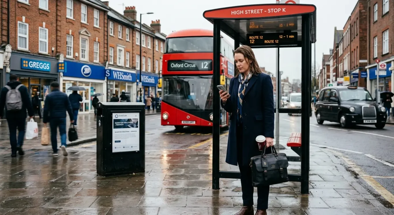
Why mobile browsing now shapes business websites
People often visit websites in short, practical moments, so the mobile experience needs to match how they really browse.
The biggest change is simple: many people now first come across a business on their phone, not when sitting at a desk with plenty of time. They may be looking while commuting, waiting for an appointment, comparing suppliers between meetings, or quickly checking opening times, location details or a phone number before getting in touch. In those moments, they are not looking for a perfect desktop-style experience on a small screen. They want fast access to the basics.
That shift affects how a business website should be planned. If someone lands on your site from a mobile search result, social media post or map listing, they need the important information straight away. Clear service summaries, easy-to-tap buttons, readable text and visible contact details matter far more than extra visual effects. A mobile-first approach helps make sure the site works well when attention is limited and the visitor wants answers quickly.
Use trusted UK data, but check your own figures too
If you want to support this with statistics, it is worth using current UK figures only from reliable sources such as Ofcom, the Office for National Statistics, or widely trusted industry reports. That matters because browsing habits change over time, and weak or outdated numbers can mislead. Just as importantly, no single statistic tells the whole story for every business. A local restaurant, a professional services firm and a B2B supplier may all see very different patterns.
Desktop still matters in many sectors, especially where people are researching in depth, downloading documents, comparing detailed information or making considered business decisions during office hours. That is why the best approach is not to assume your audience behaves like everyone else. Check your own website data in analytics reports and see which devices people actually use, which pages they visit on mobile, and where they drop off. That gives you a far clearer picture of what your website needs.
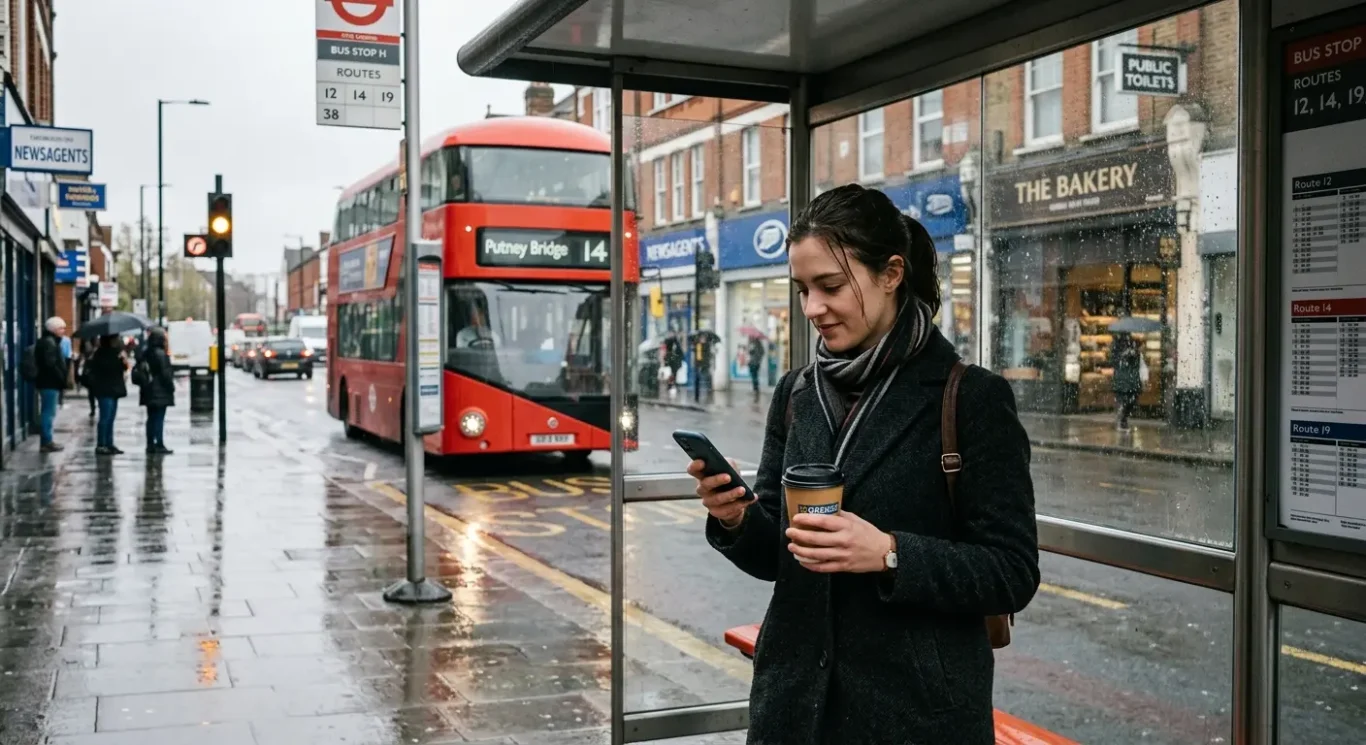
Why mobile-first matters for user experience
Good mobile design makes it quicker for people to read, find what they need and take the next step without frustration.
When a website is designed with mobile in mind first, the content usually becomes easier to use for everyone. Text is more readable without pinching and zooming, spacing is clearer, and the layout puts the most important information first. That matters because many visitors are not browsing in ideal conditions. They may be on a train, between meetings or standing outside your premises trying to check your services, opening hours or contact details.
Small frustrations add up quickly
Most people have had the experience of landing on a site with tiny text, awkward menus, slow-loading pages or buttons that are too small to tap properly. On a phone, those problems feel bigger because there is less room for error. If someone has to fight the page just to find a phone number or service summary, they may give up and try another business instead. A mobile-first approach helps reduce that friction by keeping navigation simple, making buttons easier to tap and removing distractions that get in the way.
Clear action matters more on a phone
Calls to action are the prompts that tell people what to do next, such as Call now, Request a quote or Send an enquiry. On a small screen, these need to be obvious and easy to reach. If the next step is buried halfway down the page or lost in clutter, busy visitors may not bother. Clear calls to action help people move forward when they are ready, whether that means phoning your business, filling in a short form or finding your location.
A smoother mobile experience does not just make a website feel nicer. It can also help your business appear more organised, trustworthy and easy to deal with. When pages are clear, navigation is straightforward and key actions are simple, visitors are more likely to stay focused on your message instead of the website’s problems. That can support enquiries and leave a better first impression, especially when someone is comparing several businesses in a short space of time.
How mobile-first design supports SEO
How better mobile usability can help people find your website more easily in search
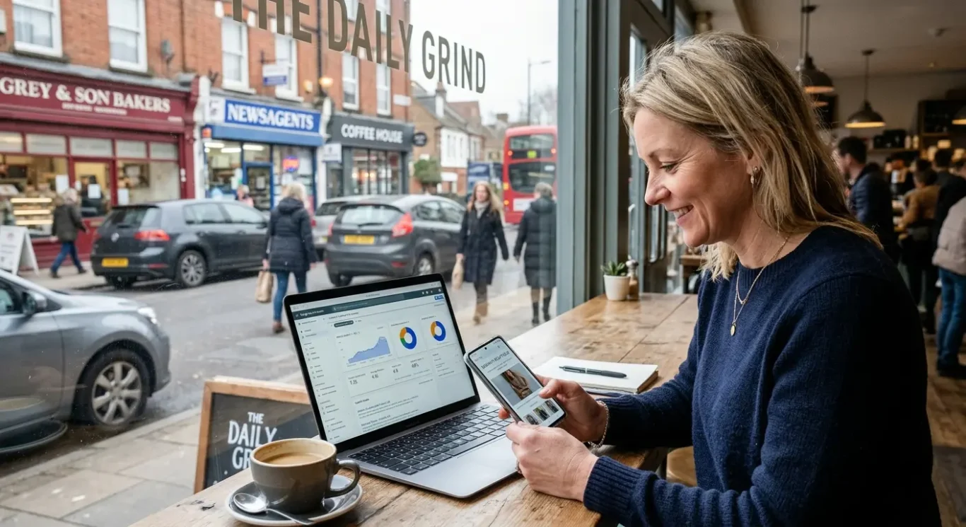
SEO stands for search engine optimisation, which simply means helping your website appear more clearly in search results when people are looking for relevant services. A mobile-first approach can support this because search engines want to show pages that are easy to use on the devices people use most often. If your site works well on a phone, visitors are more likely to find what they need quickly and stay engaged.
Why mobile usability matters
Search engines pay attention to mobile usability because a poor mobile experience creates frustration. If text is hard to read, buttons are awkward to tap or the layout breaks on a small screen, people are less likely to stay. That is not just bad for visitors. It can also make a site less competitive in search compared with pages that are clearer and easier to use on mobile.
Page speed matters here too. Slow pages can put people off before they even see your content, especially when they are out and about or using a patchy connection. Faster loading, simple layouts and clear next steps all contribute to a better user experience, and that can support search visibility because the page is easier for real people to use.
That said, mobile design is only one part of SEO. Good search performance also depends on useful content, relevant page topics, clear site structure and a website that is properly maintained. In other words, mobile-first design gives your site a stronger foundation, but it does not replace the rest of the work needed to improve visibility in search.
What a mobile-first website looks like in practice
Here is what you can actually spot on your own phone when a site has been designed properly for smaller screens.
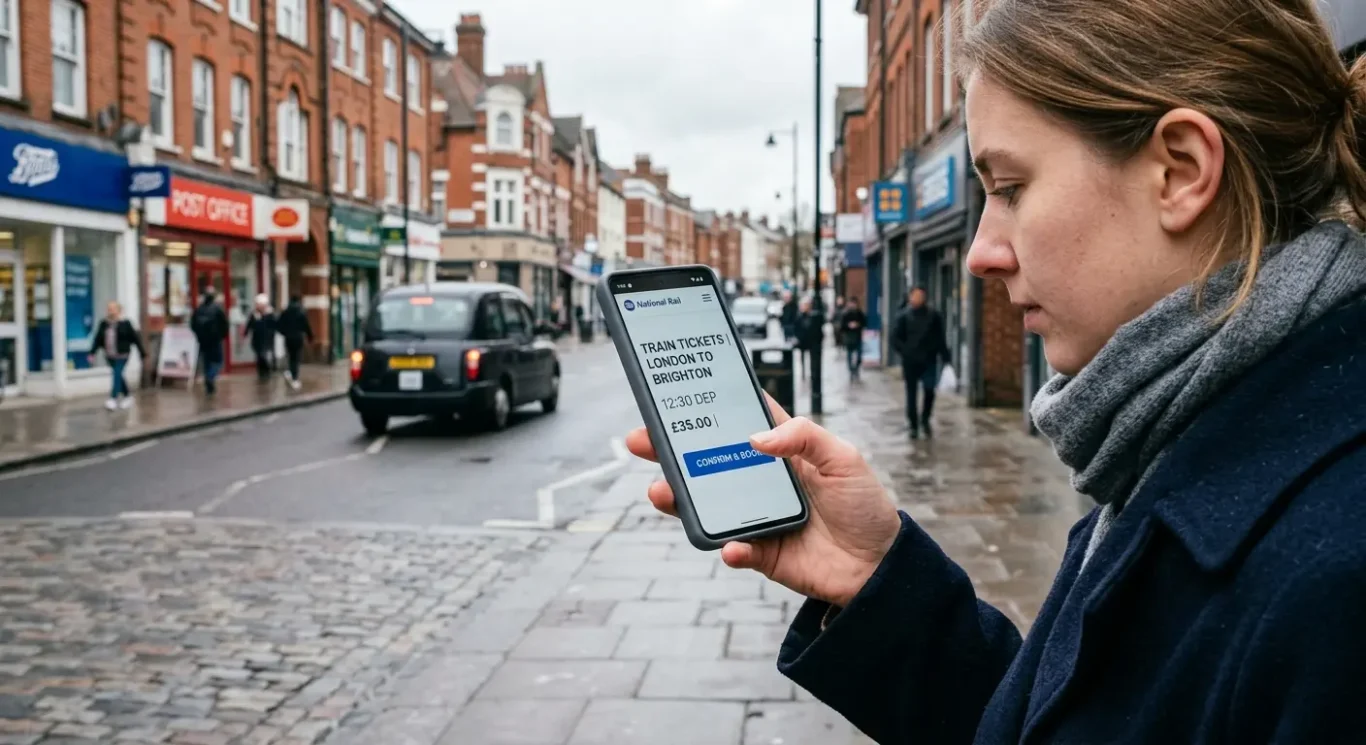
A mobile-first website usually feels straightforward from the moment it loads. The layout is simple, the text is easy to read without zooming in, and the main buttons are clear enough to tap with a thumb. You should not have to pinch the screen, hunt around for the menu or struggle to work out what to do next. Pages should also load quickly, because speed affects whether people stay long enough to read, call or enquire.
Easy actions matter most
On a service-based business website, the most important actions should be obvious. That might include a click-to-call phone number, a simple contact button, directions through a map, or a quick way to request a quote. Forms should be short and easy to complete on a phone, with enough space between fields and buttons so people are not tapping the wrong thing. If someone is trying to contact you between meetings or while travelling, those small details make a big difference.
Professional does not mean cramped
Good mobile design should still look polished. Images need to scale neatly, branding should remain consistent, and colours, typefaces and visual style should still reflect the business properly on a smaller screen. A well-designed mobile page does not feel stripped back in a way that weakens the brand. It feels focused, tidy and confident, with the most important content given room to breathe.
In practice, that means a mobile-first website is not just a desktop site squeezed to fit. It is designed around how people really browse on a phone. For a busy business owner, the quickest test is simple: open your site on your own mobile and try to complete the tasks a customer would. If reading, navigating or getting in touch feels awkward, the design probably needs more attention.
Questions to ask your web designer about mobile optimisation
Use these points as a simple checklist in a meeting, proposal review or project brief.
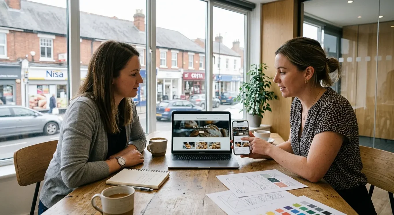
You do not need to ask highly technical questions to get useful answers. A good starting point is to ask whether the website is being designed for mobile from the beginning, rather than adjusted for smaller screens at the end. That one question often tells you a lot about the approach. If mobile is considered early, the layout, content order and key actions are more likely to work properly for people using phones day to day.
Focus on the experience your customers will have
Ask how page speed, images and navigation will be handled on mobile. In simple terms, navigation means how people move around the site, including menus, buttons and links. You can also ask how contact forms, calls to action and key service pages will perform on a phone. For example, will someone be able to read the page clearly, tap the right button easily and send an enquiry without friction? If your business depends on calls or lead enquiries, those details matter more than design trends.
It is also worth asking how the site will be tested across different screen sizes. Not every visitor will use the same phone, and a site that looks fine on one screen can feel awkward on another. You are not asking for a technical breakdown. You simply want to know how they check that pages remain readable, usable and consistent on a range of devices. This helps avoid surprises after launch.
Finally, ask how mobile design will support your branding, content and SEO. Branding should still feel professional and recognisable on a smaller screen. Content should be easy to scan, with the most important information shown clearly. SEO, or search engine optimisation, also benefits when pages are fast, easy to use and structured well for mobile visitors. If your web designer can explain these points in plain English, you are more likely to end up with a site that works well for both your business and your customers.

Common mistakes businesses make
A few practical oversights can make a website feel harder to use on a phone than it needs to be.
One of the most common issues is designing for desktop first, then trying to squeeze everything into mobile later. That approach can leave pages feeling cramped, with text, images and buttons competing for space. A mobile-first process usually works better because it forces the most important content and actions to be clear from the start, then builds up for larger screens.
Small screens need stronger priorities
Another easy mistake is trying to fit too much onto a phone screen. On mobile, people are often scanning rather than reading every word. If a page is packed with long sections, too many images or too many choices, the important message can get lost. This does not mean stripping out useful information. It means presenting it in a way that feels clear, readable and easy to act on.
Page speed is often overlooked as well. In simple terms, this means how quickly a page loads and becomes usable. Large image files are a common reason for slow pages, especially on mobile connections. If a site takes too long to load, visitors may leave before they see what you offer. Keeping image sizes under control and avoiding unnecessary page weight can make a noticeable difference.
It also helps to remember what mobile users are usually looking for. Many are not browsing casually. They want quick answers such as what services you offer, how much something might cost, where you are based, or how to contact you. If that information is buried under decorative content or hard to tap to on a phone, the site can create friction without meaning to. A good mobile experience makes those essentials easy to find.
How to know if your current site needs mobile improvement
Look for a few simple signs that show your site may be harder to use on a phone than you realise.
You do not need technical knowledge to spot the basics. If text feels too small, buttons are awkward to tap, menus are fiddly, or you have to pinch and zoom to read important information, your mobile experience likely needs work. Another warning sign is when pages feel slow or cluttered on a phone, even if they seem fine on a laptop.
Check real visitor behaviour
If you have access to website reports, look at how mobile visitors behave compared with desktop users. A high drop-off simply means people are leaving quickly, which can suggest friction on smaller screens. You do not need to dig into complex data. If the numbers are unclear, ask your web partner to talk you through the mobile picture in plain English and point out any obvious issues.
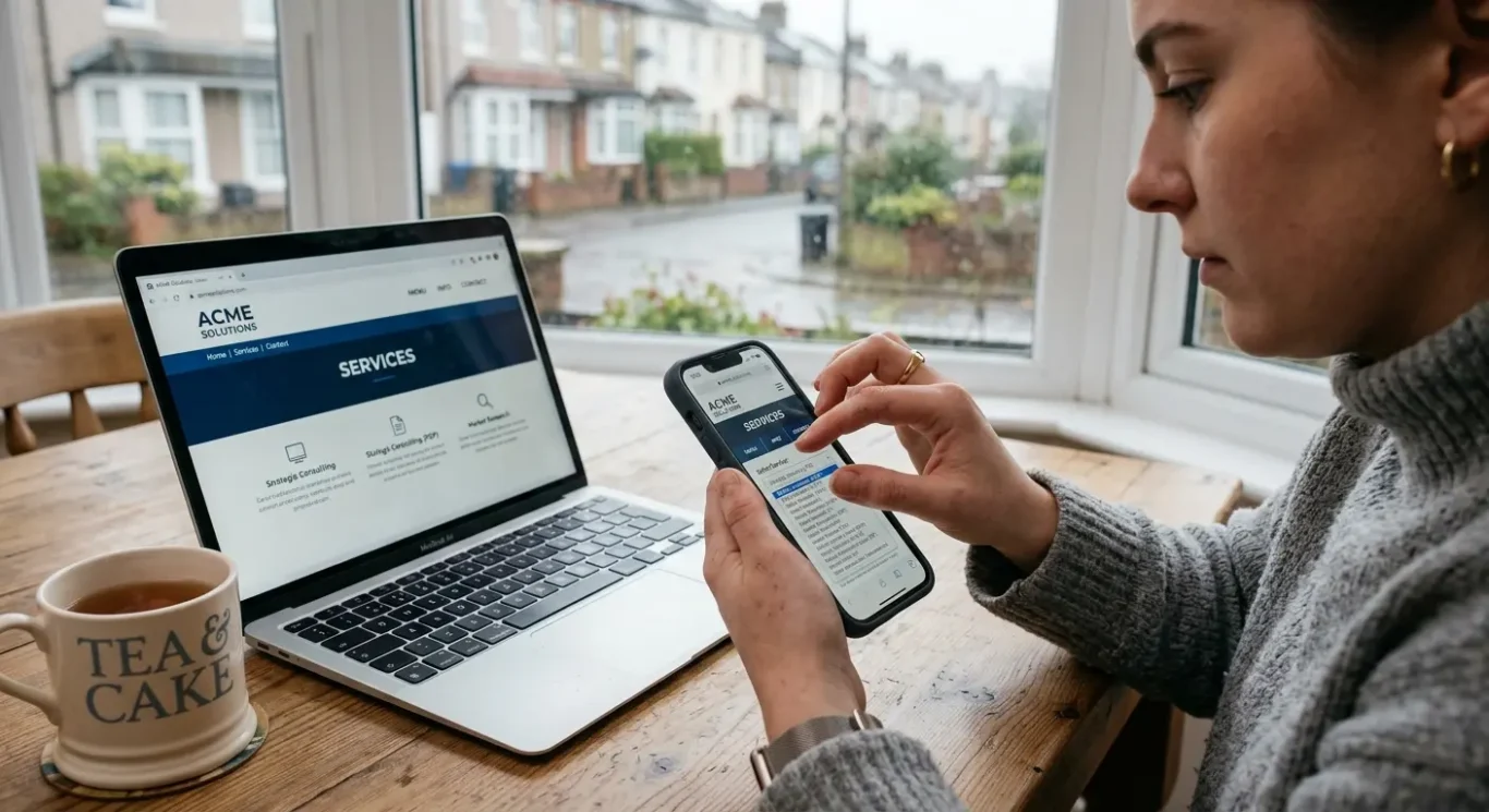
It is also worth testing the site on an actual phone, not just by shrinking a desktop browser window. Open your home, services, about and contact pages and try using them as a customer would. Can you read the headings easily, find the main information quickly, and tap the contact options without frustration? Real phone testing often reveals small annoyances that are easy to miss on a larger screen.
Start with the key pages first rather than trying to review everything at once. If those main pages are clear, fast enough and easy to use on mobile, you are already covering the areas most visitors rely on. If they are not, that is usually a strong sign your site would benefit from mobile improvement.
FAQ
Words from the designers
We often see the same issue again and again – a site looks tidy on a desktop screen but becomes hard work on a phone. A common problem is key information being pushed too far down the page, so people have to scroll before they can find what matters. We often see this create avoidable friction, especially when someone is trying to make a quick decision between meetings or on the move.
Our view is simple: if most people are likely to first meet your business on a phone, mobile-first is usually the sensible starting point, not an extra. It tends to lead to clearer choices about content, layout and priorities, which is often good for both the visitor experience and the overall quality of the website.