
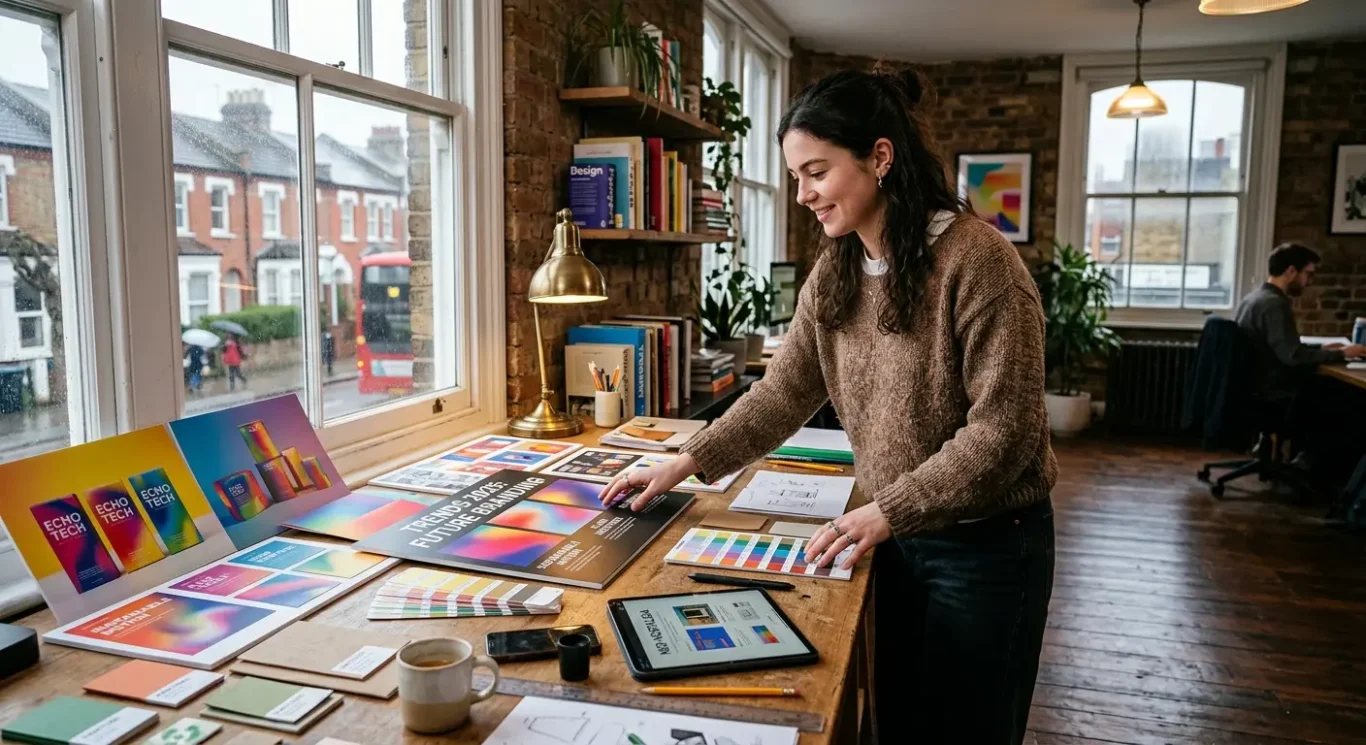
Graphic Design Trends to Watch in 2026
If you want a quick, useful view of where graphic design is heading, this roundup looks at the trends most likely to shape 2026 and what they may mean for brands in the UK. Trends only matter when they help a business look current, clear and memorable, not when they are followed just because everyone else is doing it. Some ideas will suit your brand, some will not, and that is fine. In the sections that follow, we will break down what each trend is, why it is gaining attention, and how businesses can use it in a sensible, practical way across branding, websites, marketing materials and packaging.
What will matter in graphic design in 2026
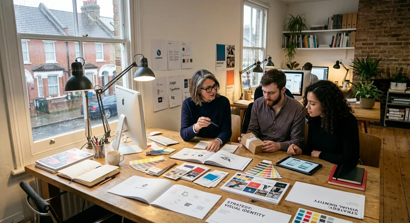
The trends worth watching are the ones that help your brand stay clear, consistent and easy to use across print, web and social media.
Before looking at specific styles, it helps to set a practical standard. Design trends should support business goals, not distract from them. If a new look makes your brand harder to recognise, harder to read or harder to apply across everyday marketing, it is probably not the right choice no matter how current it seems.
The strongest trends usually balance originality with usability. In simple terms, usability means how easily people can read, understand and interact with what you put in front of them. That matters just as much on a website or social post as it does on a brochure, presentation deck or piece of packaging.
A simple way to judge a trend
A good trend is not just visually interesting. It should improve clarity, so your message is easy to take in. It should strengthen consistency, so your brand feels joined up wherever it appears. It should offer flexibility, so it works across different formats and campaigns. And it should add distinctiveness, so people remember you rather than confusing you with a competitor.
Not every trend will suit every brand, and that is completely normal. A law firm, restaurant, start-up and retail label will each need something different. The most useful question is not “Is this trend popular?” but “Will this help our business communicate better and look more recognisable in the places our audience actually sees us?”
Colour palettes: warmer, calmer and more characterful
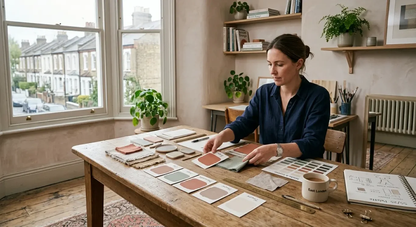
Brands are moving towards colour choices that feel more human, easier on the eye and better suited to everyday use across digital and print.
One of the clearest shifts for 2026 is away from very sharp, icy palettes and towards colours that feel softer and more grounded. Muted earthy tones, softened neutrals and less clinical background colours can make a brand feel more approachable without losing professionalism. Think warmer off-whites, clay, stone, olive, sand or softened charcoal rather than stark white and heavy black everywhere. For busy audiences, this creates a calmer visual experience and often makes content feel easier to take in.
Use strong colour as a highlight, not the whole story
At the same time, brands are not becoming bland. Confident accent colours are being used more carefully to add personality and draw attention where it matters. An accent colour is simply a stronger colour used in small amounts for emphasis. On a website, that might mean buttons, links or key calls to action. On social posts, it could be a bold frame, icon or headline strip. In presentations and brand materials, it helps guide the eye to the important point without overwhelming every page or slide.
Readable always beats fashionable
Accessible contrast matters more as colour systems become softer. Contrast means the difference between two colours, such as text against a background. If that difference is too weak, content becomes harder to read, especially on mobile screens, in bright daylight or during a quick scan between meetings. A warmer palette can still work well if key text, buttons and headings stay clear enough to read at a glance. This is where thoughtful design makes the difference between something that looks nice and something that actually works.
For businesses, the practical approach is simple. Build a small palette with dependable base colours, one or two softer supporting tones and a limited number of stronger accents. Apply it consistently across your website, social posts, presentations and printed brand materials so everything feels connected. This gives you room for personality and contrast while keeping the overall look calm, trustworthy and easy to manage as your brand appears in more places.
Typography: expressive type with readable structure
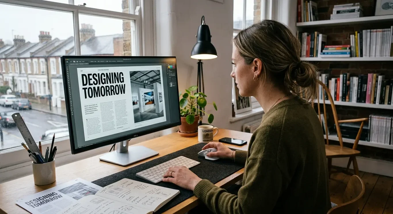
Brands are giving headings more personality while keeping the rest of the content clean, clear and easy to read.
Typography simply means the way text looks and works in design. It includes the style of letters, their size, spacing and how they are arranged on a page or screen. In 2026, the shift is towards type that does more of the brand-building work. Businesses are using more distinctive headline styles to create character, while keeping the main reading text calm and straightforward so people can scan and understand it quickly.
Personality at the top, clarity underneath
A practical way to use this trend is to pair display type for headlines with simple body text. Display type means a more expressive font used in larger sizes for headings, campaign lines or key messages. It helps a brand look more recognisable and less generic. The body text underneath should then do the opposite job – easy to read, sensible in tone and comfortable across web pages, brochures, presentations and social graphics. This combination gives you impact without making everyday communication harder for your audience.
If you come across variable fonts, they can be useful for flexibility. In plain English, a variable font is one font file that can offer a range of styles, such as lighter or bolder versions, without needing lots of separate files. For businesses, that can make it easier to keep a consistent look across a website while adapting headlines, subheadings and smaller text for different uses. The idea is not to create endless variation, but to give your brand a bit more control without adding visual clutter.
Readability still comes first
Whatever style you choose, readability needs to hold up on both desktop and mobile. Headings should still be easy to recognise at a glance, and body text should not be too small, too light or too tightly packed. It is worth checking how your type looks on an actual phone screen, not just a large monitor in the office. If a font feels clever but slows people down, it is probably the wrong choice. For most businesses, the best result is a type system that feels distinctive in the important places and effortless everywhere else.
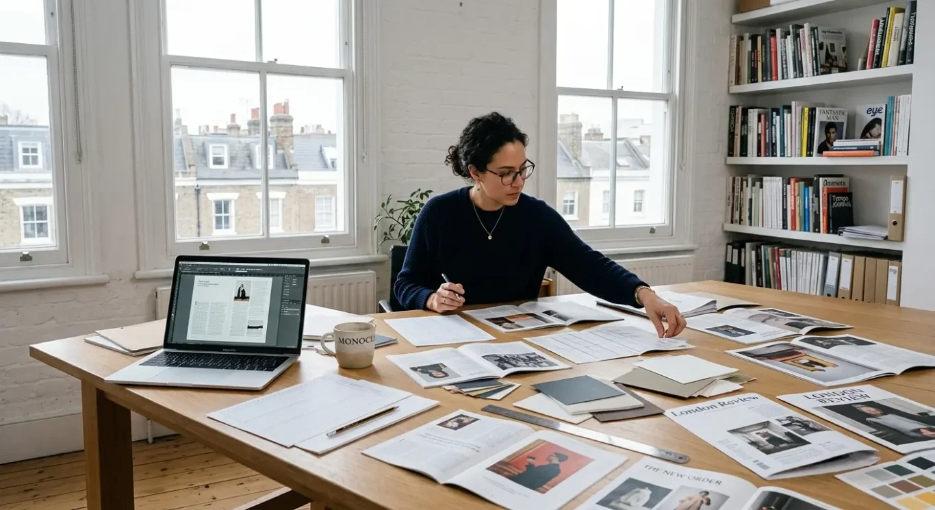
Layouts: editorial influence with room to breathe
Magazine-style structure is shaping business design, with clearer sections, better spacing and content that is easier to scan on screen and in print.
One of the strongest layout trends for 2026 is the move towards editorial thinking. In simple terms, that means borrowing the clarity and rhythm of magazines and published reports, then adapting it for websites, brochures and brand materials. A big part of this is the use of grids. A grid is a structure for arranging content, helping text, images and headings line up in a way that feels organised rather than random. When used well, grids make designs look more polished and make information easier to follow.
Space is doing more of the work
Generous white space is also becoming more important. White space simply means the empty room around content. It is not wasted space. It gives headings more impact, helps key messages stand out and stops pages from feeling crowded. This is one reason the style is gaining popularity. People are reading quickly, often on mobile, and clutter slows them down. A layout with breathing room feels more confident and easier to trust.
The most effective examples mix bold focal points with a simple information flow. That could mean a strong headline, a striking image or one key statistic at the top, followed by smaller sections that guide the reader through the rest. The important thing is balance. You want enough visual punch to catch attention, but not so much that the page becomes hard to use. On mobile, this matters even more. Sections need to stack neatly, text needs to stay readable and the order of information has to make sense on a smaller screen.
For businesses, this approach is especially useful in brochures, landing pages and reports. A brochure can feel more premium and easier to browse. A landing page can direct attention towards the main message and next step without distractions. A report can handle large amounts of information in a way that feels clearer and less daunting. If you are updating brand materials in 2026, this is a practical trend to watch because it improves both appearance and usability at the same time.
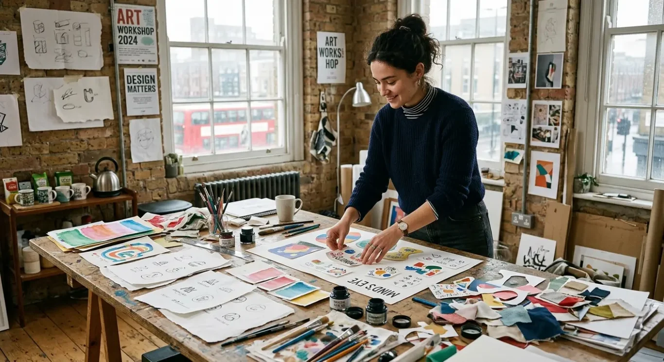
Illustration styles: crafted, imperfect and brand-specific
Brands are moving away from generic visuals and using illustration more deliberately to look distinctive, clearer and easier to remember.
One of the clearest design shifts for 2026 is the move towards illustration that feels more original and less polished in a generic way. That includes hand-drawn details, visible texture, uneven lines and shapes that feel made rather than pulled from a template. The reason it is gaining popularity is simple. Many brands now use the same stock imagery, the same icons and the same clean-but-interchangeable visual language. Crafted illustration gives a business more character. It can make a brand feel more human, more confident and more recognisable when people see it again.
Where illustration works especially well
Illustration is often a better choice than stock photography when you need to explain something abstract, simplify a service or create a consistent look across different materials. A custom icon set, for example, can help a website, brochure or presentation feel joined up. Small spot illustrations can add personality to packaging, reports, menus or social content without overwhelming the message. This does not mean photography is no longer useful. In many sectors, real photography still builds trust. The strongest brands tend to choose illustration where it adds clarity or character, then combine it with photography where realism matters more.
Simple 3D is becoming more useful
Another style gaining ground is simple 3D-style visuals. Here, 3D means graphics with depth, shading or a lightly modelled look rather than flat shapes. Used carefully, this can make diagrams, product visuals or digital interfaces feel more engaging and easier to understand. The key word is simple. Most businesses do not need flashy effects. A softer 3D approach can add interest without making the design feel heavy or distracting. It tends to work best in tech, property, product marketing and service explainers, but the right approach always depends on the brand.
For businesses, the practical takeaway is to treat illustration as part of the brand system, not just decoration. If your icons, web graphics, packaging details and marketing visuals all share the same style, the brand becomes easier to recognise at a glance. That matters in crowded markets where attention is short. If you are considering this trend in 2026, start by identifying where customers need more clarity, warmth or distinction. Then build a small, usable illustration style around those needs rather than chasing a look that may not fit your sector.
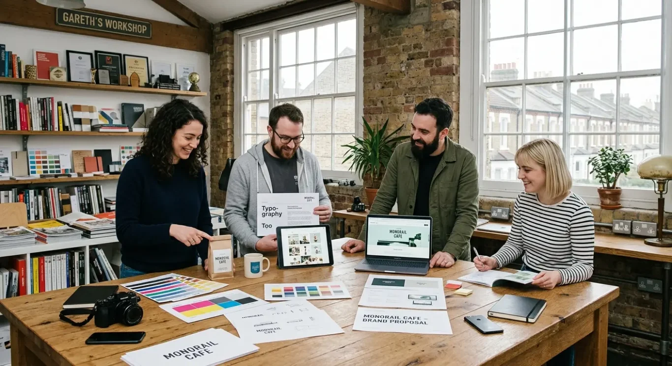
Branding approaches: more flexible, more recognisable
In 2026, stronger brands are building practical systems that work across websites, social media, pitch decks and print, rather than relying on a logo alone.
One of the most useful branding trends for 2026 is the move towards identity systems that can adapt to different places without losing their core look. For a growing business, branding is not just the logo. It includes colour, typography, imagery, tone of voice and layout too. When those elements are working together, a business is easier to recognise whether someone finds it on LinkedIn, visits the website, opens a sales deck or picks up a printed brochure.
Why flexibility matters
Businesses now appear in more formats than ever, and each one has different demands. A square social graphic needs a different layout from a homepage banner. A pitch deck needs clarity and pace, while printed material often needs more structure and detail. A flexible identity system gives you a set of rules and assets that can stretch across these touchpoints without looking inconsistent. That might include a defined colour palette, a small group of type styles, image treatments, grid layouts and a clear tone of voice. The result is consistency across channels, which helps people recognise and trust the brand over time.
Refreshing without losing recognition
This trend is also changing how businesses update their branding. In many cases, the best refresh is not a dramatic reset. It is a careful improvement of what already works. If customers already recognise your colours, name style or overall feel, keep the strongest parts and modernise the weaker ones. You might simplify the typography, tighten the layout system, improve photography guidance or create more usable templates for web pages, proposals and social posts. That approach keeps familiarity in place while making the brand easier to use day to day.
For busy teams, that is where the business value sits. A good branding system saves time, reduces guesswork and helps every piece of communication feel like it comes from the same company. In practice, that means fewer off-brand documents, clearer marketing materials and a more joined-up customer experience. If you are reviewing your brand for 2026, think beyond how it looks in a logo file. Ask whether it works just as well on screen, in print and in the hands of the people who need to use it every week.
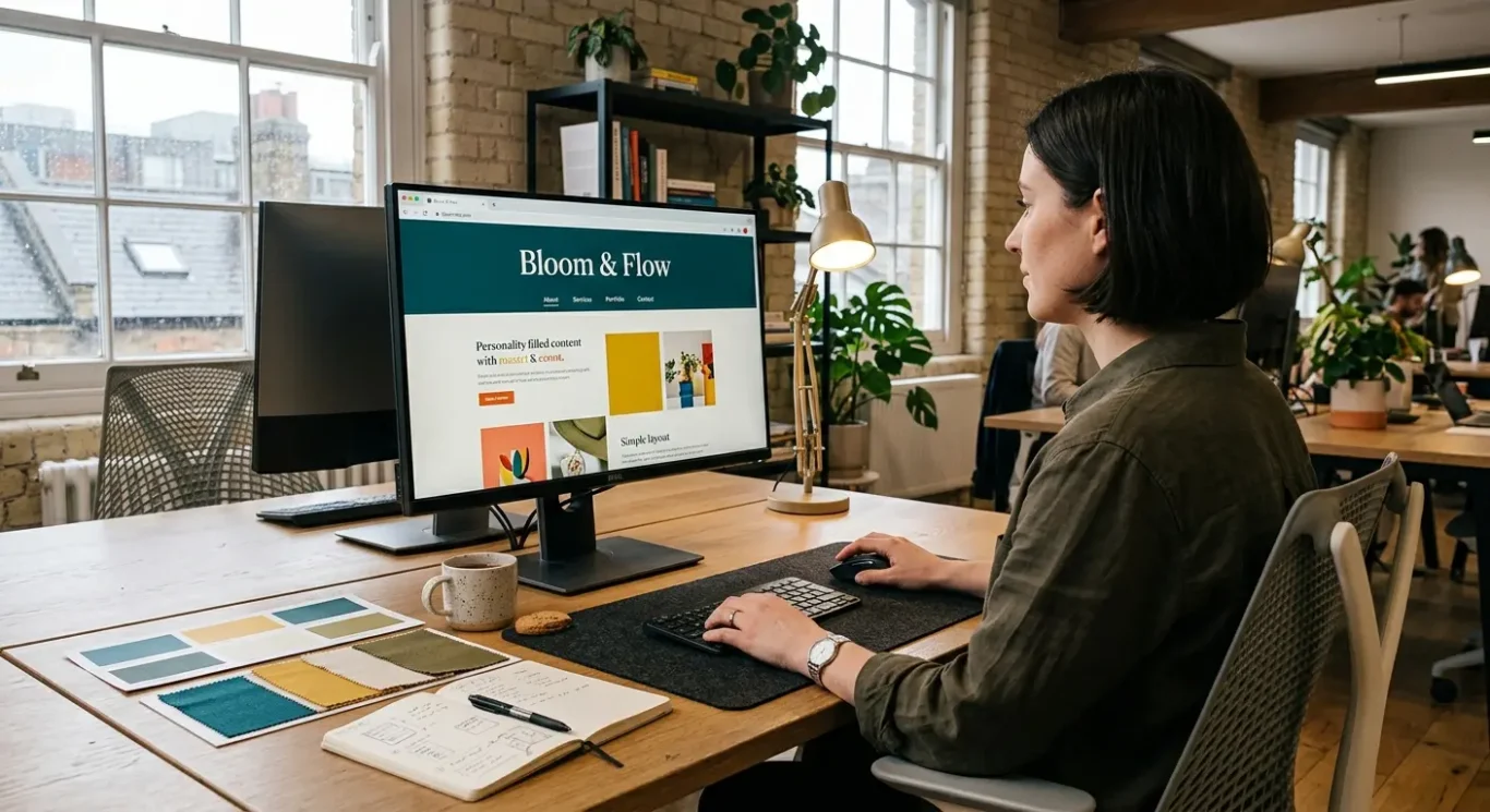
Web design aesthetics: cleaner pages with richer personality
In 2026, the strongest websites are likely to be easier to scan, easier to use and more distinctive at the same time.
One of the clearest web design trends for 2026 is the move towards simpler page structures with stronger brand character. In practice, that means clear navigation, obvious page sections and content that tells people quickly where they are and what to do next. For busy visitors, fast understanding matters. If a homepage, service page or landing page takes too long to make sense of, people often leave before the message has landed.
That does not mean websites will become bland. In fact, many brands are using bolder typography, more confident colour and sharper imagery to create a clearer first impression without making pages feel crowded. The key is restraint. A strong type style, a focused palette and well-chosen images usually do more for a website than filling every area with effects or extra elements. When the visual identity is clear, the page can feel memorable while still being calm and easy to read.
Use movement carefully
Subtle motion can still play a useful part in 2026, but only when it supports the content. A gentle hover effect, a smooth transition between sections or a small cue that draws attention to an important action can help guide the eye. What works less well is movement that competes with the message, slows the page or makes reading harder. Good web design should feel polished, but usability should stay in charge.
For businesses, this trend matters most when the website feels connected to the rest of the brand. If your website looks polished but your sales deck, brochure, social graphics and marketing materials feel unrelated, the overall impression becomes weaker. Consistency in typography, colour, imagery and tone helps people recognise the business across every touchpoint. It also makes the brand feel more established, which is especially important for companies that want a professional, joined-up presence in 2026.
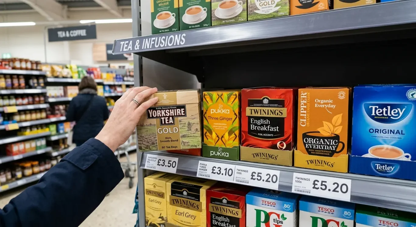
Packaging design: tactile cues and shelf clarity
For labels, boxes and retail packs, the priority is helping people notice the product quickly and understand it just as fast.
In 2026, packaging is moving towards clearer front-of-pack design. That usually means fewer competing messages, stronger hierarchy and a more obvious route to the key information. In simple terms, hierarchy is the order in which the eye reads things. The product name, what it is and the main selling point need to land first. For busy shoppers, that clarity matters. If the front of pack tries to say everything at once, it often says nothing clearly.
Recognition in seconds
Colour and typography are doing more of the heavy lifting. Strong colour choices can help a product stand out on shelf and also make ranges easier to navigate, especially when different variants need to be recognised quickly. Typography plays the same role. A clear type style, consistent sizing and better contrast make packs easier to scan, whether someone is standing in a shop or glancing at a product image online. The most effective packaging systems are not just attractive. They make recognition faster.
Premium does not have to mean busy
Where brands want a more elevated feel, premium details are being used with more restraint. That might be texture, a matt or gloss finish, a foil accent, or illustration that adds character without clutter. These touches work best when they support the brand rather than compete with the message. For food, drinks and retail packaging especially, a small number of well-judged details often creates a stronger impression than a pack overloaded with effects.
For businesses, the bigger opportunity is to treat packaging as part of the full brand system, not a separate job. The colours, type choices, illustration style and tone used on pack should connect naturally with your website, brochures, social graphics, signage and sales materials. When that alignment is in place, the brand feels more established and easier to trust. It also makes life simpler internally, because every new label, box or campaign starts from the same visual rules instead of being reinvented each time.
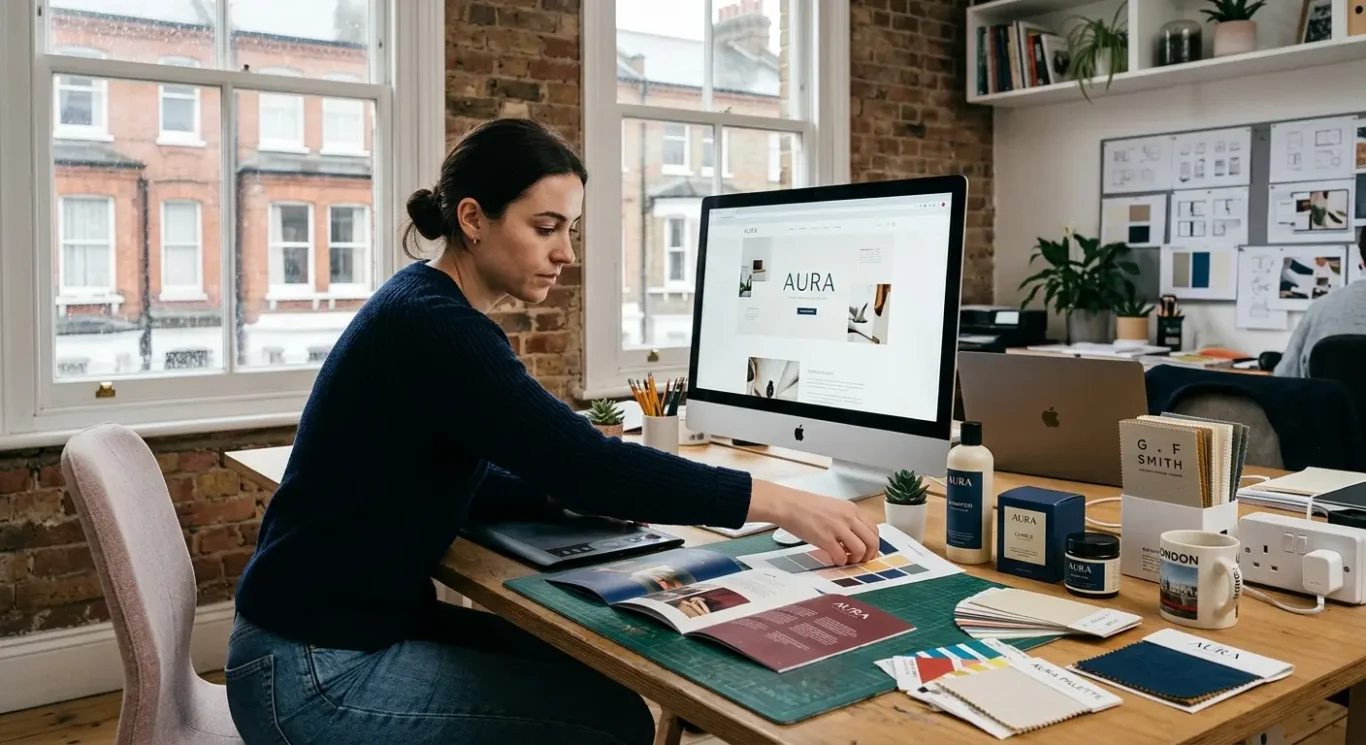
Designing for many formats at once
In 2026, good design needs to stay clear and recognisable wherever people see it – on screens, in print and on pack.
One of the biggest shifts behind all of these trends is the move towards adaptable design systems. In simple terms, that means a set of visual rules that can flex across different uses without losing the brand feel. A colour palette might need to work on a website banner, a brochure cover and a product label. A type choice might need to read well on social media graphics, adverts and presentations. The aim is not to make everything look identical. It is to make every piece feel connected.
Consistency saves time
For busy businesses, this matters for practical reasons as much as creative ones. When core design choices are already defined, new materials are quicker to produce and easier to approve. Teams are not starting from scratch every time they need a menu, catalogue, sales deck or campaign graphic. That consistency also reduces the risk of mixed messages. If your website looks modern but your printed materials and labels feel unrelated, the brand can seem less established than it really is.
The most useful approach is to decide which assets your business actually uses most, then make sure those touchpoints work together. For one company that might be website banners, brochures and adverts. For another it could be menus, catalogues and labels. The exact list will vary, but the principle is the same. Colours, typography, imagery and layout should support recognition across every format your customers are likely to see.
That is really where 2026 design is heading. Trends in colour, type, layout, illustration, branding, web design and packaging are all becoming more connected. The businesses that use them well will not just follow what looks current. They will build a visual system that works hard across day-to-day marketing, saves time internally and gives customers a clearer, more consistent impression of the brand.
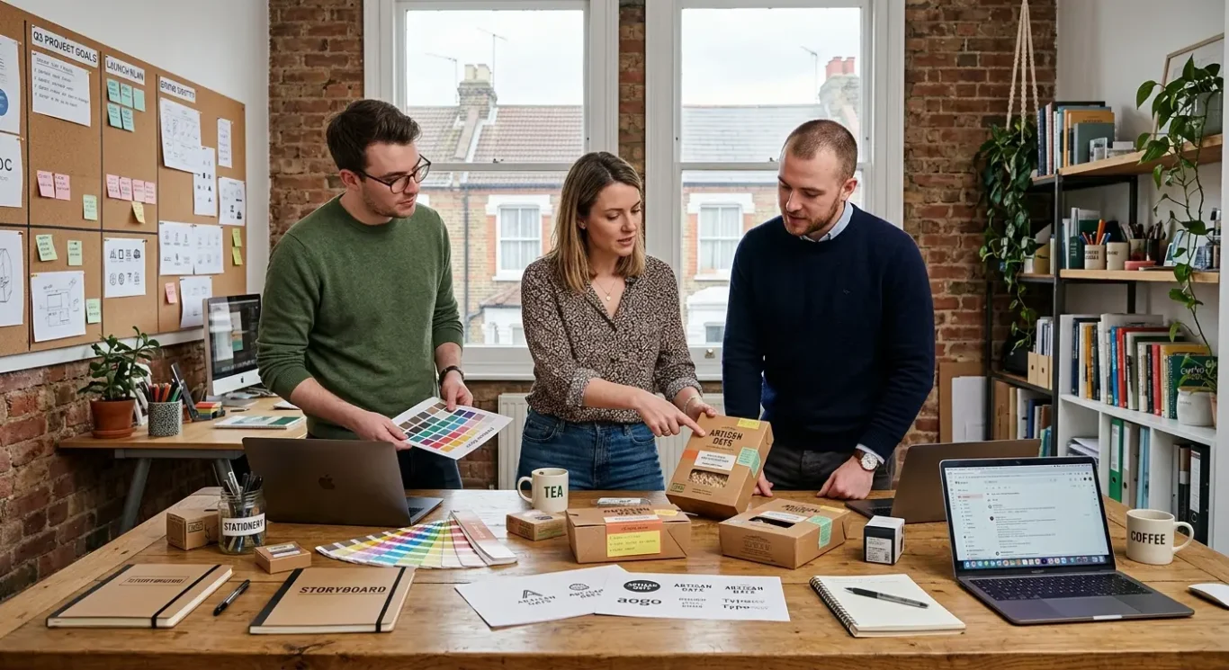
How businesses can choose the right trends without wasting time
A practical way to decide what is worth using now, what can wait, and what fits your brand best.
The best place to start is not with what is fashionable, but with what your business is trying to achieve. If your goal is to look more established, attract a different type of client, improve clarity online or make packaging easier to recognise, those aims should guide every design choice. It also helps to look at what your audience actually needs. A trend that feels fresh in one sector may feel distracting or out of place in another, so the right question is whether it supports the message you want people to take away.
Try changes in smaller places first
You do not need to refresh everything at once. In many cases, it is far more sensible to test a trend in one area before rolling it out more widely. That could mean trying a new colour accent on campaign graphics, using a more expressive type style in social posts, or updating one section of your website before changing the whole thing. Small tests make it easier to judge what feels right, what performs well and what still fits the wider brand.
Keep one visual thread running through everything
Even when you use newer ideas, the overall brand should still feel connected. That visual thread might come from consistent colours, a recognisable typography system, a familiar illustration style or a shared tone across print and digital materials. The aim is not to make every asset identical. It is to make your website, brochures, packaging, presentations and marketing materials feel like they belong to the same business. That is usually what makes design feel current and credible rather than random.
For busy teams, this is often where working with a design team can help. A joined-up approach across branding, print and web makes it easier to choose trends that suit the business rather than applying them in isolation. It can also save time by turning scattered design decisions into a clearer system that works across day-to-day materials. Not every trend will be right for every company, and there is no need to chase all of them. The most useful choices are the ones that support your goals, suit your audience and still make sense a year from now.
FAQ
Words from the designers
We often see businesses chasing what feels new before checking what already works, and a common problem is that the brand starts to look inconsistent across different materials. We often see the strongest results when one simple process step is followed first – reviewing the core logo, colours and type choices together before any new design direction is applied.
Our calm judgement on 2026 trends is simple: the best ones will be the trends that make your brand clearer, more recognisable and easier to use, not just more fashionable. If a style helps people understand who you are faster and trust what they are seeing, it is worth considering. If it adds noise, it is probably one to leave alone.