
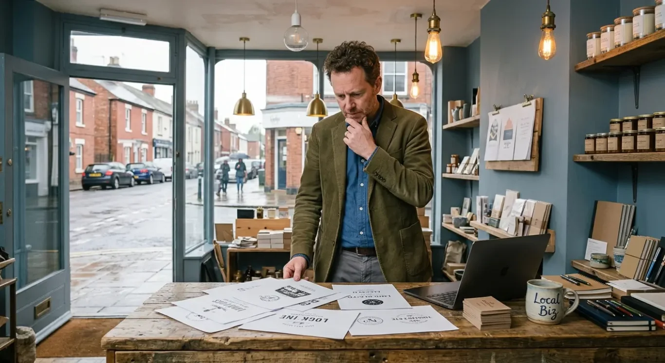
7 Common Logo Design Mistakes That Make Your Business Look Amateur
Most business owners make a quick judgement when they see a logo, especially when they are busy, and your customers do exactly the same. If a logo feels cluttered, dated or hard to read, it can weaken that first impression before anyone has looked at your service, your pricing or your website. This guide covers some of the most common logo design mistakes that make a business look less professional than it really is, from using too many colours to choosing fonts that do not fit. The good news is that you do not need design training to spot the warning signs – and yes, some of them are easier to miss than they should be.
Why your logo matters more than you think
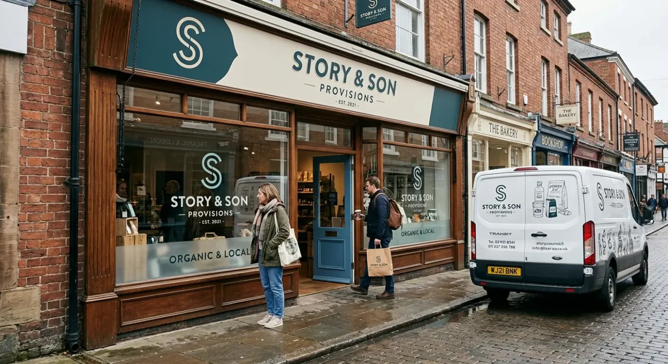
For most people, it is the first visual cue they see, so it needs to look right and work well wherever your business appears day to day.
Your logo is not just a nice graphic to place on a website. It is part of your wider brand identity, which means the overall look and feel people connect with your business. When someone sees your logo, they start forming an opinion about how professional, reliable and established you seem, often in a matter of seconds.
That first impression matters because your logo often appears before any conversation happens. A potential customer might notice it on your website header, a business card, an email signature or the side of a van. In hospitality, they may see it on a menu or takeaway packaging. If it looks unclear, awkward or out of place, it can quietly reduce trust before they have even read what you offer.
It needs to work in real life, not just on screen
A logo has to do its job across everyday business use. That includes shop signage, printed marketing material, packaging, social media profiles and internal documents. Something that looks fine when large on a desktop screen may become hard to read when shrunk into a corner of a leaflet or added to a small email footer. Good logo design is not about making it complicated. It is about making it usable.
A good logo will not fix every branding problem on its own, but it does give your business a stronger starting point. It should be clear, appropriate for your audience and easy to use across different places and formats. When that foundation is right, the rest of your branding has a much better chance of feeling consistent and professional.
Mistake 1: Using too many colours
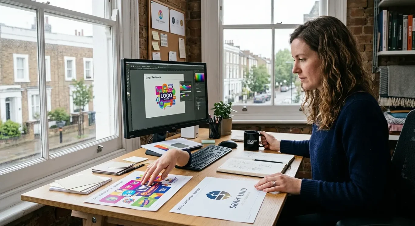
A crowded colour palette can make a logo feel untidy, harder to recognise and awkward to use across print and digital formats.
When a logo uses too many colours, it often starts to look busy rather than professional. A limited palette usually feels more confident because it gives the design a clear direction instead of trying to do too much at once. It also makes the logo easier to remember, which matters when people only glance at your brand for a few seconds on a website, sign or social post.
Where too many colours cause problems
Extra colours can create practical issues as well. Printing can become less consistent, especially across different materials and suppliers. Embroidery may lose detail or look uneven. Signage can become more expensive and harder to reproduce cleanly. On screen, colours may appear different from one device to another, so a logo that relies on several similar shades can quickly start to look inconsistent.
A simple way to avoid this is to start with a small set of colours and test the logo in real situations. Check how it looks on a business card, a website header, a social profile image and a printed leaflet. Just as importantly, make sure it still works in black and white. If the logo only looks right in full colour, that is often a sign it is relying on colour too heavily rather than strong design.
Once your colours are chosen, keep them consistent across your brand materials. That means using the same versions of those colours on your website, stationery, signage and marketing pieces, rather than guessing each time. Consistency helps your business look more established, and it stops your brand from appearing slightly different every time someone sees it.
Mistake 2: Making the design too complicated
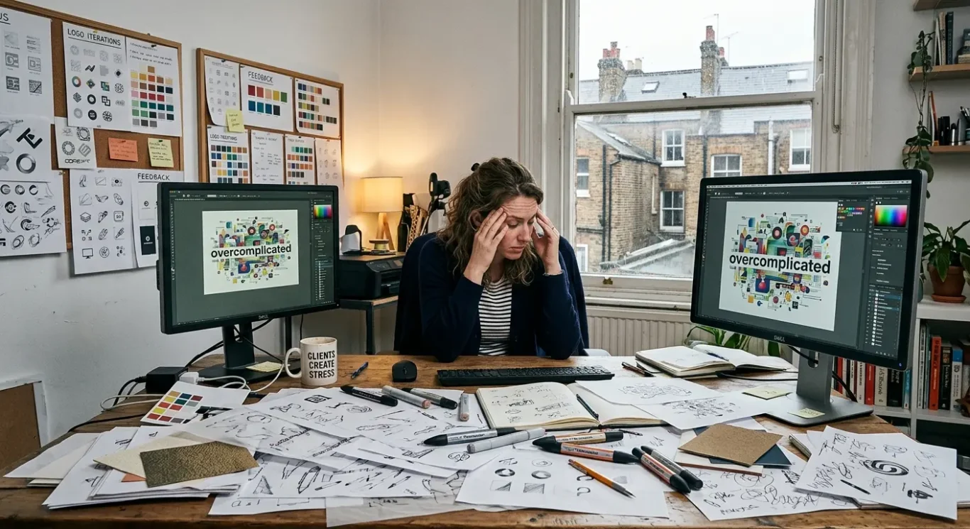
Too many shapes, effects or small details can make a logo harder to read, harder to remember and less useful when space is limited.
One of the most common problems in logo design is trying to fit too much into one mark. Extra lines, icons, shadows, patterns or decorative effects may seem like they add personality, but they often do the opposite. They make the logo feel cluttered and distract from the main idea. Simplicity helps recognition because people can understand it quickly and remember it more easily. In most cases, a logo that gets to the point will do a better job than one that tries to show everything about the business at once.
Where complexity starts to cause problems
This usually becomes obvious when the logo is used in smaller spaces. A detailed design might look acceptable on a large presentation slide, then fall apart in a social profile image, on a mobile screen or as a favicon, which is the tiny icon shown in a browser tab. Fine details can disappear, text can become unreadable and shapes can blur together. The same problem shows up on small printed items such as business cards, labels or promotional materials, where there is not much room to work with.
This is where scalability matters. In simple terms, scalability means the logo should still work when made bigger or smaller. It should look clear on a shop sign, but also stay recognisable in the corner of a website or on a printed leaflet. If a design only works at one size, it is likely too complicated to be practical.
The best way to avoid this mistake is to focus on one clear idea and build around that. Ask what the logo really needs to say, then remove anything that does not help. If a shape, effect or detail adds confusion rather than clarity, it is probably not improving the design. A strong logo is usually the result of careful editing, not adding more.
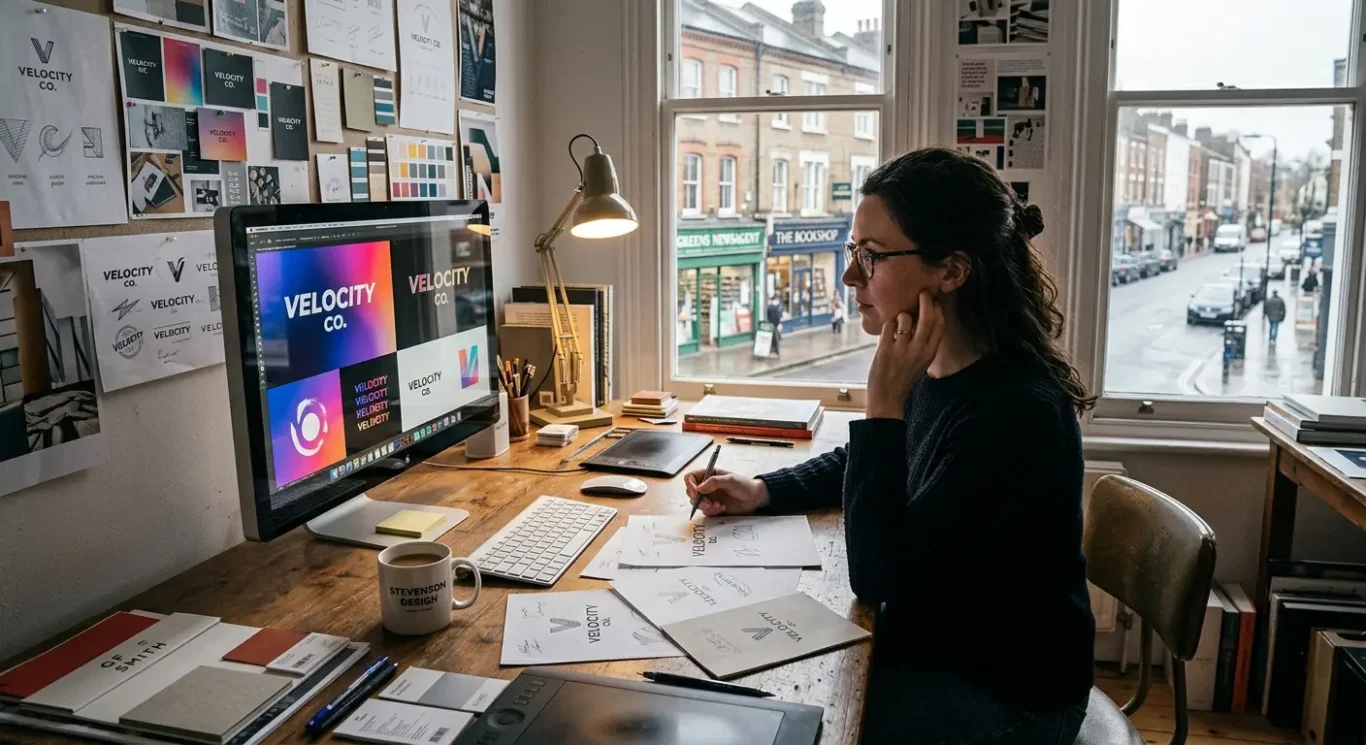
Mistake 3: Following design trends blindly
Choosing a fashionable look over the right fit for your business can make a logo feel dated far too soon.
It is easy to see why businesses get pulled towards current styles. A logo that feels up to date can help a brand look relevant and professional. The problem starts when the whole design is built around a trend rather than around what the business actually stands for. There is a difference between a logo that feels current and one that depends on a particular look being popular. The first still has a clear idea behind it. The second can lose impact as soon as tastes move on.
Why trends can create extra cost later
Trend-led logos often date more quickly, which means they may need replacing sooner than expected. That can be disruptive as well as expensive. A logo does not only sit on a website. It appears on business cards, presentations, signage, social media, marketing material and other brand assets. If the design starts to feel out of step after a short time, refreshing everything can become a bigger job than most businesses planned for.
A better approach is to base design decisions on brand personality, audience and long-term use. Think about how you want the business to come across – established, approachable, premium, creative, dependable – and what will make sense to the people you want to reach. Then consider where the logo will be used over time. A strong logo should still feel right in a few years, not just right now.
That does not mean trends are always bad. They can be useful for inspiration, especially in small details such as colour balance, spacing or illustration style. But they should support the design, not control it. When the foundation is built on what makes the business distinct, the logo has a much better chance of staying effective even as styles change.
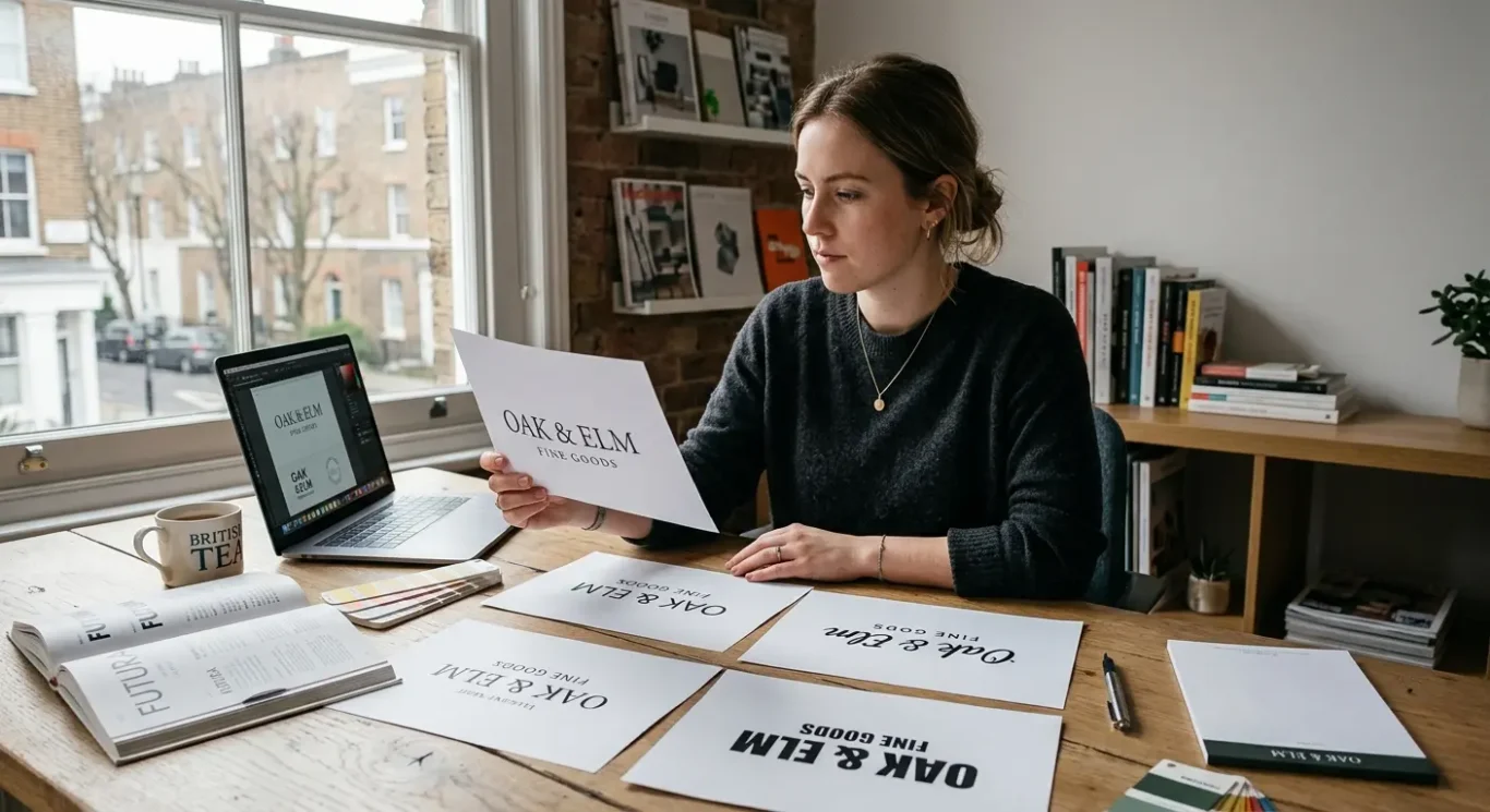
Mistake 4: Choosing the wrong font
The style of lettering affects how your business feels and how easily people can read your name.
A font, or typeface, is simply the style used for the letters in your logo. It might seem like a small detail, but it has a big effect on first impressions. People often judge a business in seconds, and the lettering helps shape that judgement. A clean, well-chosen font can make a brand feel reliable and considered. The wrong one can make it look confused, dated or less professional than it really is.
Problems usually start when the font is hard to read, too decorative or just does not suit the business. If people have to stop and work out what the name says, the logo is not doing its job. Overly stylised lettering can also create inconsistency. For example, a firm offering serious professional services may lose credibility if the type feels playful or messy, while a friendly customer-facing brand may seem cold if the lettering feels too formal. The font does not need to be boring, but it does need to make sense for the business.
Match the tone, not just your personal taste
The best choice depends on the impression you want to give. Some businesses need to feel professional and dependable. Others need to feel warm, creative or premium. That is why there is no single best font style for every logo. What matters is whether the lettering supports the brand message. A good fit makes the whole identity feel more coherent, while a poor fit can make the business seem unclear about who it is and who it is trying to attract.
To avoid this mistake, start with clarity. Choose lettering that is easy to read and test the business name at different sizes, from a website header to a printed leaflet or business card. If you are combining fonts, keep it simple so they do not compete with each other. In most cases, a restrained choice will work harder for longer than something flashy that looks impressive for five minutes but causes problems in everyday use.
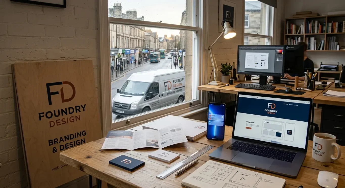
Mistake 5: Not thinking about scalability
A good logo needs to stay clear and recognisable wherever it appears, from a social profile image to shop signage, packaging and printed material.
Scalability simply means how well a logo works at different sizes and in different places. A logo might look excellent on a large screen during the design stage, but that is only one test. In real use, it may need to fit on a website header, a social icon, a business card, a brochure, a vehicle graphic or a sign above a premises. If it only works in one setting, it will quickly start causing problems.
When a logo is designed for just one size or one format, the weaknesses usually show up fast. Tiny details disappear when the logo is reduced. Thin lines can break up or become hard to see. Text that felt balanced at a large size can become cramped and difficult to read. Some layouts also become awkward in tighter spaces, especially if the logo is very wide, very tall or built around lots of small elements.
Test it before it becomes a problem
The practical way to avoid this is to test the logo early and properly. View it small and large. Check whether it still feels clear in colour and in monochrome, which means using one colour such as black or white. Try it in digital spaces and in print, because a logo that looks sharp online may not feel as strong on packaging, stationery or signage. If key parts vanish or the whole thing starts to feel cluttered, the design probably needs simplifying.
Strong logos usually have enough flexibility to cope with everyday use. That might mean a simpler version for very small spaces, or a layout that can adapt without losing recognition. The goal is not to make the logo complicated so it can do everything. It is to make it clear enough that it still looks like your brand wherever people see it.
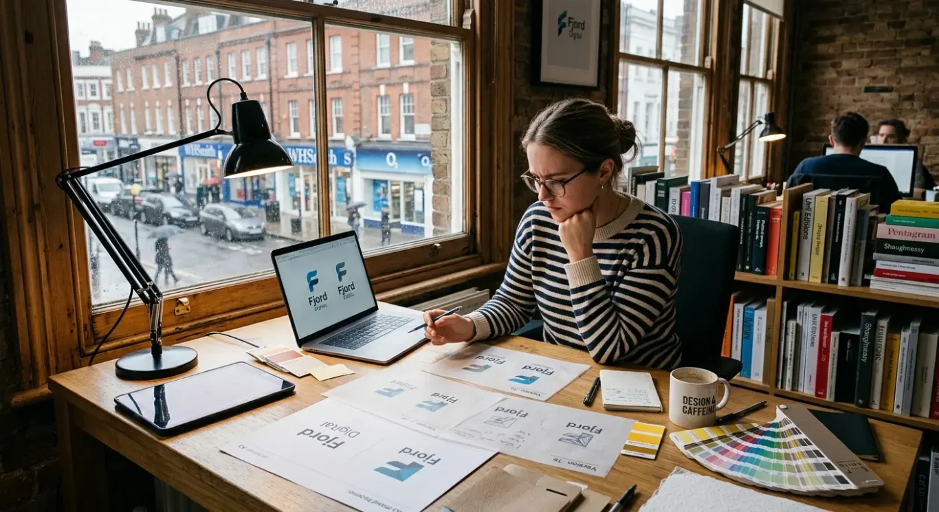
Mistake 6: Copying competitors
When your logo looks too much like others in your market, it becomes harder for people to remember you
It is normal to look at other businesses in your sector before starting a logo project. That kind of research helps you understand what customers already expect and what visual patterns appear again and again. The problem starts when a logo follows those patterns so closely that it blends into the background. If several businesses use the same sort of icon, colour balance or layout, customers may struggle to tell them apart. That weakens brand recognition, which simply means how easily people remember and identify your business.
Research should inform, not dictate
There is a big difference between studying a market and copying what others do. Good research shows you where the clichés are and helps you avoid them. It can reveal that many firms in one industry rely on the same overused symbols, such as abstract globes, roof lines, leaves, shields or generic initials in a badge. Those choices are not always wrong, but when everyone reaches for the same visual shortcuts, the result can feel generic and forgettable rather than distinctive.
This is especially common in crowded sectors where businesses want to look established, trustworthy or premium. In trying to fit in, they often end up looking almost interchangeable. A familiar style may feel safe in the short term, but it rarely gives people a strong reason to remember one company over another. If a logo could belong to any business in the same category, it is not doing much to support your brand.
Build from what makes you different
The practical way to avoid this is to get clear on what sets your business apart before any design direction is chosen. That might be your personality, your type of customer, your level of service, your heritage, your tone of voice or the way you want people to feel when they deal with you. Once that is defined, the logo can be shaped around those qualities instead of borrowed sector habits. The aim is not to look strange for the sake of it. It is to create something recognisable, relevant and clearly yours.

Mistake 7: Ignoring the target audience
A logo should connect with the people you want to attract, not just reflect the owner’s personal taste.
This is where logo design needs to come back to business reality. A logo is not artwork created only to please the person who signs off the project. It is a business tool, and its job is to help the right people recognise your brand, trust it and remember it. If the design is based mainly on personal preference, it can end up sending the wrong message to the people you actually want to reach.
That mismatch happens more often than people realise. A serious professional service might choose a playful mark with bright colours and a casual style, then wonder why it does not feel credible. On the other hand, a creative consumer brand can look too stiff and formal if the logo feels cold, rigid or corporate. Neither approach is automatically wrong in every case, but the design still needs to fit the kind of impression your audience expects when they first come across your business.
Think about context, not just style
A practical way to avoid this is to step back and look at your customers, your brand values and where the logo will appear. Ask what matters most to the people you want to attract. Do they need reassurance, clarity, energy, warmth or a sense of quality? Then consider where they will see the logo – on a website, social media profile, shop sign, proposal document, packaging or vehicle graphics. A logo may look appealing in isolation but still feel out of place in the settings where your audience actually meets your brand.
Good design balances personality with suitability. You do not need to copy your sector or strip away all character just to look acceptable. The aim is to create something distinctive that still feels right for the people you want to win over. When a logo reflects both who you are and what your audience responds to, it has a much better chance of working in the real world.
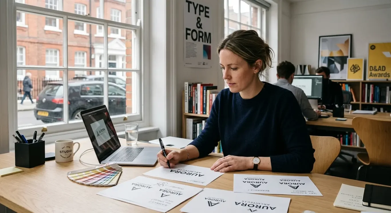
A quick checklist before you approve a logo
Use these simple checks to review a draft properly and ask better questions before you sign it off.
If you are looking at a logo draft, start with the basics. Is it clear at a glance? Is any text easy to read? Does it feel recognisable rather than generic? A good logo should be simple enough to understand quickly and distinctive enough that it does not blur into the rest of your market.
Check the practical details
Look at the colours and fonts with a critical eye. Are there too many colours to manage consistently? Does the font suit your business and stay readable in small spaces? Ask to see the logo used very small as well as large. If it becomes hard to read on a mobile screen, social profile image or email footer, that is a warning sign.
It is also worth checking where the logo will need to work. Will it still look right on your website, social media, printed material, signage and presentation documents? Some logos look fine in one setting but fall apart when moved across different media. You want something that keeps its character wherever your audience sees it.
Finally, ask one simple question: will this still feel right in a few years? You do not need a logo to last forever without updates, but it should not feel tied to a passing style. If it is clear, readable, suitable for your audience and practical across everyday use, you are much more likely to be approving something that supports the business properly.
FAQ
Words from the designers
We often see businesses put a lot of effort into a logo and still end up with something that feels awkward in use. A common problem is trying to make one small mark do too many jobs at once, which usually leads to clutter, weak typography and a style that does not feel confident. In practice, one simple check is to reduce the logo to a very small size and see whether the name and shape still read clearly.
If there is one judgement call worth making, it is this: a logo does not need to look clever to look professional. For most businesses, the stronger choice is usually the clearer one – something appropriate, readable and easy to use consistently rather than something busy, fashionable or overworked.