10 Signs Your Website Is Driving Customers Away
Most businesses do not lose enquiries because of one spectacular mistake. It is usually the quieter stuff – a slow page, a muddled menu, a site that feels awkward on mobile – that chips away at people’s patience until they leave. If you are busy running a company, that kind of problem is easy to miss because you already know where everything is. Your visitors do not.
This is a quick website check-up for owners and managers who want the useful version, not a technical lecture. Below are 10 common signs your website may be putting people off, why each one matters, and what you can do about it without turning it into a full-time project. Think of it as the digital equivalent of noticing the front door sticks before your guests mention it.

1. It takes ages to load
If your page is slow to appear and awkward to use, even interested visitors will lose patience and move on.
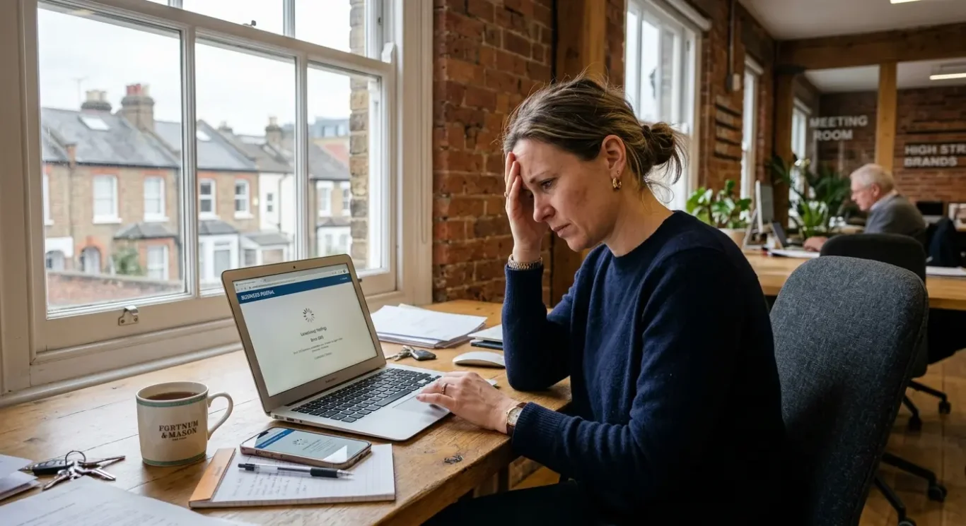
Loading speed simply means how quickly a page shows up and becomes usable. It matters because people make a judgement fast. If they click through and are left staring at a half-loaded page, it feels sloppy, untrustworthy and a bit behind the times. Fair or not, that first impression sticks.
What usually causes it
In plain English, slow websites are often weighed down by things they do not really need. Huge image files are a common culprit, especially if someone has uploaded print-quality photos straight onto the site. Too many add-ons, pop-ups, animations or chunky page sections can also make a page drag its feet. Sometimes the hosting is part of the problem too – that is the service that stores your website and serves it to visitors.
What to do about it
Start with the easy wins. Compress images so they still look good without being unnecessarily heavy. Remove features that are nice in theory but add little in practice. If a moving banner, fancy effect or extra widget is not helping someone take the next step, it may be more trouble than it is worth. It is also worth asking your web team to review whether your hosting is up to the job.
You do not need to turn your website into a stripped-back ghost town. The aim is simply to help pages open quickly and feel ready to use. A fast, tidy site feels more professional, and that gives visitors one less reason to disappear before they have even seen what you offer.
2. It is painful to use on a mobile
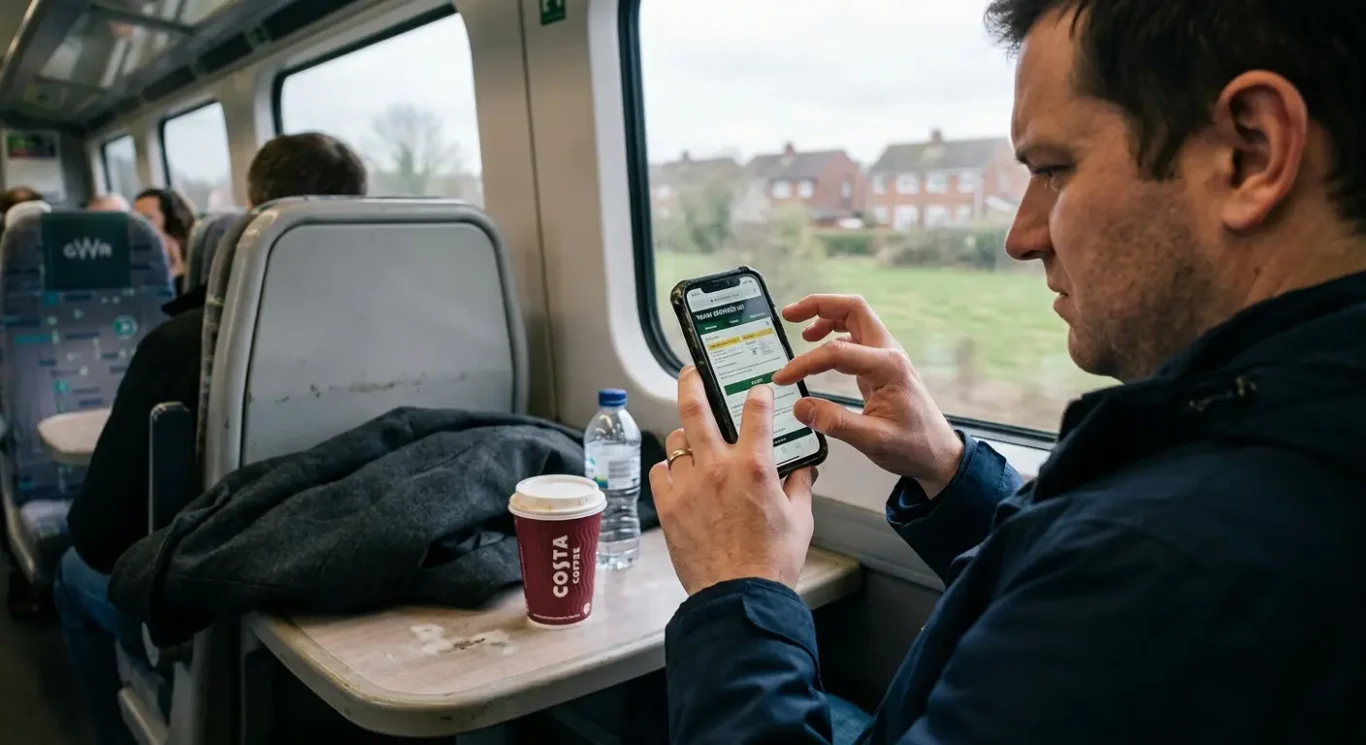
For plenty of people, your website gets its first audition on a phone – between meetings, on the train, or while comparing a few businesses in a hurry.
Mobile is not the backup version of your website. For many visitors, it is the main event. If your site looks fine on a desktop but turns into a fiddle on a phone, you are making it harder for people to trust you and much easier for them to leave. When someone has to pinch, zoom, squint or stab at the screen just to read a page, it does not feel professional.
What puts people off
Common mobile problems are easy to recognise once you look for them: tiny text, awkward buttons, menus that are hard to open, forms with far too many fields, and content that runs off the screen or sits in odd layouts. Even small irritations add up. If your phone number is hard to tap, your enquiry form feels like paperwork, or your main message is buried halfway down the page, people may decide it is simpler to try the next company instead.
This matters because mobile usability affects both confidence and action. A tidy, easy-to-use page suggests your business is organised and current. A clumsy one suggests the opposite, fair or not. If a visitor cannot quickly understand what you do and how to contact you, enquiries drop off before they have really started.
The fix is usually practical rather than dramatic. Test your key pages on several phones, not just your own, and check them like a new visitor would. Can you read the text comfortably? Tap the buttons easily? Fill in the form without muttering under your breath? Make buttons larger, keep text clear, shorten forms, and make sure important content fits the screen properly. A good mobile experience should feel effortless – which is exactly why it works.
3. Visitors cannot work out where to click
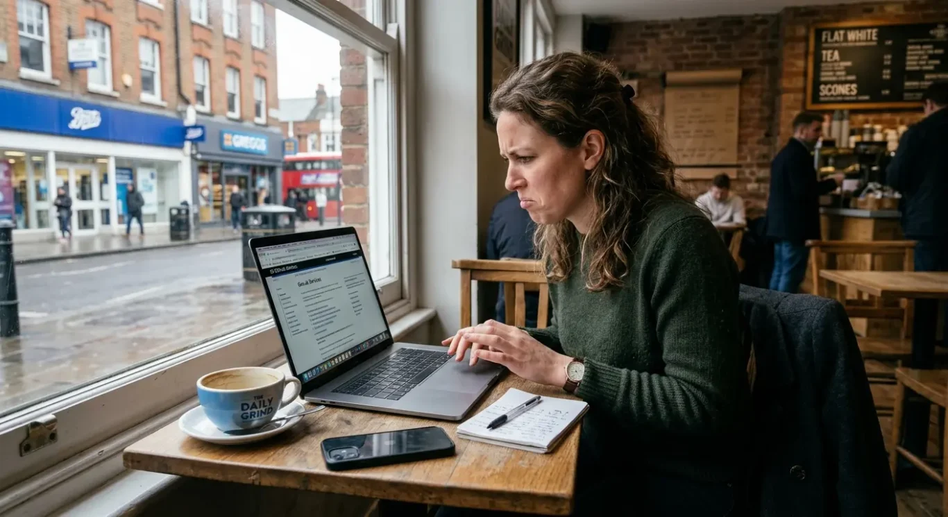
If people have to hunt for the basics, many will give up and move on.
A confusing website often does not look broken at first glance. It just feels hard work. The menu is crowded, page names are vague, and useful information seems to have been hidden as if it were a family secret. If a visitor cannot quickly find your services, prices, contact page or examples of your work, they are unlikely to spend their lunch break playing detective.
What this usually looks like
Common signs include menus packed with too many options, labels such as “Solutions” or “Resources” that tell people very little, and key pages buried several clicks deep. Sometimes every page tries to do everything at once, so there is no obvious next step. Instead of guiding visitors forward, the site sends them wandering about in circles until they remember there are other tabs open.
Clear structure helps people move towards an enquiry because it reduces effort. When someone can instantly see what you do, who it is for and how to get in touch, they feel more confident and are more likely to act. Good navigation is not about being clever. It is about making the obvious things obvious, so people can get from interest to action without friction.
The fix is usually refreshingly unglamorous. Cut back the menu to the pages people need most, use straightforward names like “Services”, “About” and “Contact”, and make sure your top tasks are easy to reach from every key page. If most visitors want to see your work, understand your offer and send an enquiry, prioritise those paths first. A website should feel less like a maze and more like a polite receptionist who points people in the right direction straight away.
4. It looks like it has not been touched in years
People make a quick judgement from what they see, and an older-looking site can quietly undermine trust.
This is not really about chasing website design trends or trying to look flashy. It is about credibility. Visitors use visual clues to decide whether a business feels current, active and dependable, often within seconds. If a website looks as though it was last updated when everyone still said “surfing the web”, people may start wondering what else has been left behind.
What makes a site feel dated
Usually it is a combination of things rather than one dramatic problem. Old-fashioned layouts, cramped pages, clashing fonts, inconsistent colours, tired stock imagery and blurry visuals can all make a site feel stuck in the past. So can pages that do not match each other properly, as if they were designed by different people on different planets. Even if the information is still accurate, the overall impression can feel neglected.
That matters because people often link presentation with reliability, fair or not. A dated website can make a business seem less established in the wrong way – not experienced, but inactive. Visitors may wonder whether you are still trading, whether your services are up to date, or whether attention to detail is a bit hit and miss. When someone is choosing who to contact, those small doubts can be enough to send them elsewhere.
The good news is that this does not always call for a full rebuild. Often, a thoughtful refresh does the job. Update typography so the text feels clear and easy to read, replace weak imagery with better photography or stronger brand visuals, give content more space so pages feel calmer, and make sure colours, buttons and headings are consistent across the site. These are practical changes, but they can make your website feel far more current, professional and reassuring.
5. There is no clear next step
A call to action is simply a prompt that tells people what to do next – call, book, ask for a quote or view your services.
If someone lands on your website, likes what they see, and then has to guess what happens next, that is a problem. Unclear or missing calls to action lose leads because interested visitors often will not hang around working it out for themselves. They may mean to get in touch later, but later has a habit of turning into never.
What a muddled journey looks like
This usually shows up in small but costly ways. A page talks about a service but gives no obvious way to enquire. A button says something vague like “Learn more” when what people really need is “Ask for a quote”. Contact details are buried in the footer, or there are too many competing options on one page, all waving for attention like overexcited contestants on a quiz show. The visitor is interested, but not guided.
The fix is not to turn every page into a hard sell. It is to give each page one sensible main action based on what the visitor is likely to want at that point. On a service page, that might be “Ask for a quote” or “Book a call”. On your homepage, it could be “View services” or “See our work”. Clear buttons, straightforward wording and contact options placed where people naturally look can make a surprising difference.
A good website should feel helpful, not bossy. If the next step is obvious, easy and available at the right moment, people are far more likely to take it. You are not pushing them down a funnel. You are simply making it easier for them to say yes when they are ready.
6. The content talks in circles
People should grasp what you do, who you help and why it matters within seconds
If a visitor lands on your website and is met with phrases like “innovative solutions for modern businesses” or “helping brands unlock their potential”, they have learnt precisely nothing. Vague slogans, generic claims and long-winded introductions might sound polished in a meeting, but on a website they often create fog. Busy people do not want to decode your message like it is a cryptic crossword.
Clarity beats clever every time
Your website does not need to win awards for mysterious wording. It needs to tell people, quickly and plainly, what you offer, who it is for and what problem it solves. Clear messaging matters because visitors make snap judgments. If they cannot work out whether you are relevant to them within moments, they are likely to leave and try the next option.
This problem often shows up as too much waffle. A homepage spends three paragraphs talking about passion, vision and excellence before mentioning the actual service. A headline says something broad like “Creative thinking that delivers results” instead of “Branding and website design for growing businesses”. The words are not wrong exactly. They are just not doing enough heavy lifting.
The fix is usually refreshingly simple. Use plain-English headlines that say what you do. Write customer-focused copy that talks about their needs, not just your internal philosophy. Trim anything that does not help someone understand or take action. If a sentence could apply to almost any business in London, it is probably too vague. Good website copy should feel less like a speech and more like a useful answer.
7. It is full of clutter
When too much is happening on one page, people stop reading and start looking for the exit
A cluttered website does more than look messy. It makes pages harder to scan, harder to trust and harder to use. If visitors are hit with too many colours, long slabs of text, flashing offers, pop-ups and five different buttons all asking for attention, they have to work far too hard to decide what matters. Most will not bother. They will leave.
Too much choice creates friction
This is not just about appearance. It is about decision overload. A homepage with a newsletter pop-up, a cookie banner, a chat box, a moving slider, social icons, and three different calls to action can feel like being cornered by eager salespeople before you have even taken your coat off. Even good content gets missed when everything is shouting at once.
The fix is not to strip the life out of your site or make everything plain for the sake of it. It is to give the page a clearer order. Put the most important message first. Use more white space so elements have room to breathe. Cut back on competing buttons. Break text into shorter sections. Remove pop-ups and distractions that interrupt rather than help. A calmer layout makes it easier for people to follow the page and feel confident about what to do next.
A useful test is to glance at the page for five seconds and ask, “What is this page about, and what should I do now?” If the answer is not obvious, there is probably too much going on. Good graphic design does not need to be empty. It just needs to be organised enough that people can think clearly.
8. The contact process feels like hard work
If getting in touch takes too many steps, plenty of ready-to-buy visitors will quietly give up and try someone else.
This is the awkward moment where interest turns into effort. Someone likes what they see, decides to enquire, then meets a contact form that asks for their life story, a phone number tucked away in the footer, or an email link that goes nowhere. Hidden contact details, missing location information and broken links all create doubt. If people have to hunt for basic ways to reach you, many will not hang about.
Convenience matters most at the point of enquiry
When someone is ready to make contact, they are already doing you a favour. They should not need detective skills. A long form can feel like paperwork before a conversation has even started. No postcode, no area served, or no clear indication of whether you are London-based can also make people hesitate, especially if they want to know you are relevant and reachable. At this stage, even small bits of friction can send them elsewhere.
The fix is usually straightforward. Ask only for what you genuinely need to start the conversation. Make your phone number, email address and contact page easy to find. If location matters to your service, say clearly where you are based or which areas you work with. And if you use buttons or forms, test them properly. A contact page that looks fine but does not actually work is the digital version of locking the front door during opening hours.
Not every business needs the same setup. Some clients prefer a quick form, others want to call, and some would rather send an email in their own time. The practical answer is to offer sensible options and make each one easy to use. The less effort it takes to reach you, the more likely people are to do exactly that.
9. It gives people little reason to trust you
Visitors want a few clear signs that your business is real, capable and still active.
Trust matters on any website, but especially for service businesses. People are not buying a product they can hold in their hand straight away. They are deciding whether to contact you, share their details and possibly spend a fair amount of money based on what they see on screen. If the site feels vague, thin or oddly anonymous, that decision becomes much harder.
What helps people feel reassured
You do not need to cover the site in badges and bold claims. A few grounded trust signals usually do more. Recent case studies show the sort of work you do and the results you helped create. Testimonials add a human voice. Clear service information tells people exactly what you offer. Team details, even if brief, make the business feel more real. Professional photography also helps, because visitors can tell the difference between genuine images and the usual stock-photo handshake nonsense.
The key is to make credibility easy to spot without turning the site into a sales pitch. Keep case studies current, use testimonials that sound like actual clients, and explain services in plain English rather than fluffy promises. If you show your team, make sure the information is up to date. If you use photos, choose images that reflect the real business. Fresh, specific details are far more convincing than pages of self-congratulation.
A practical check is this: if someone lands on your site for the first time, can they quickly answer who you are, what you do, who you work with and how to get in touch? If not, trust is probably being left to chance. The good news is that this is usually fixable with a few sensible additions, not a dramatic rebuild.
10. It is not being checked or updated
A website is not something you launch, feel pleased about, and then forget exists.
Even a decent site can start putting people off when it quietly goes stale. An old offer that expired months ago, portfolio work from years back, broken pages, or business details that are no longer accurate all create doubt. Visitors may not stop to analyse it. They just get the feeling that something is off, and that is often enough to make them leave.
Small checks prevent awkward surprises
Regular reviews help you catch problems before customers do. That matters because most people will not politely email to say your contact form is broken or your opening information is wrong. They will simply move on. A quick monthly look at your key pages, your contact details, your main calls to action and your latest work can spot the obvious issues before they start costing you enquiries.
This does not need to become a full-time hobby. Simple habits are usually enough. Once a month, check the site on your mobile, test your forms, click through the main pages, and read the core messaging with fresh eyes. Does it still reflect what you offer now, who you help and how people should contact you? If not, tidy it up before it starts telling the wrong story.
The point is not to fuss over the site every five minutes. It is to keep it useful, accurate and reassuring. A website is not a brochure to leave in a drawer. It is part of how people judge your business, and if nobody maintains it, even a good one can quietly start driving customers away.
FAQ
Words from the designers
We often see good businesses lose enquiries for very ordinary reasons, and we often see the same pattern again and again: the site looks acceptable at first glance, but small frustrations build up until people leave. A common problem is forgetting to test the main pages on a phone after updates, which sounds minor until a button, image or contact form stops working properly.
If your website feels a bit tired, slow or awkward to use, that is usually worth treating as a genuine business issue rather than a cosmetic one. In most cases, customers are not being harsh – they are simply busy, and they will take the easier option.